

UI/UX
3D
Visual Design
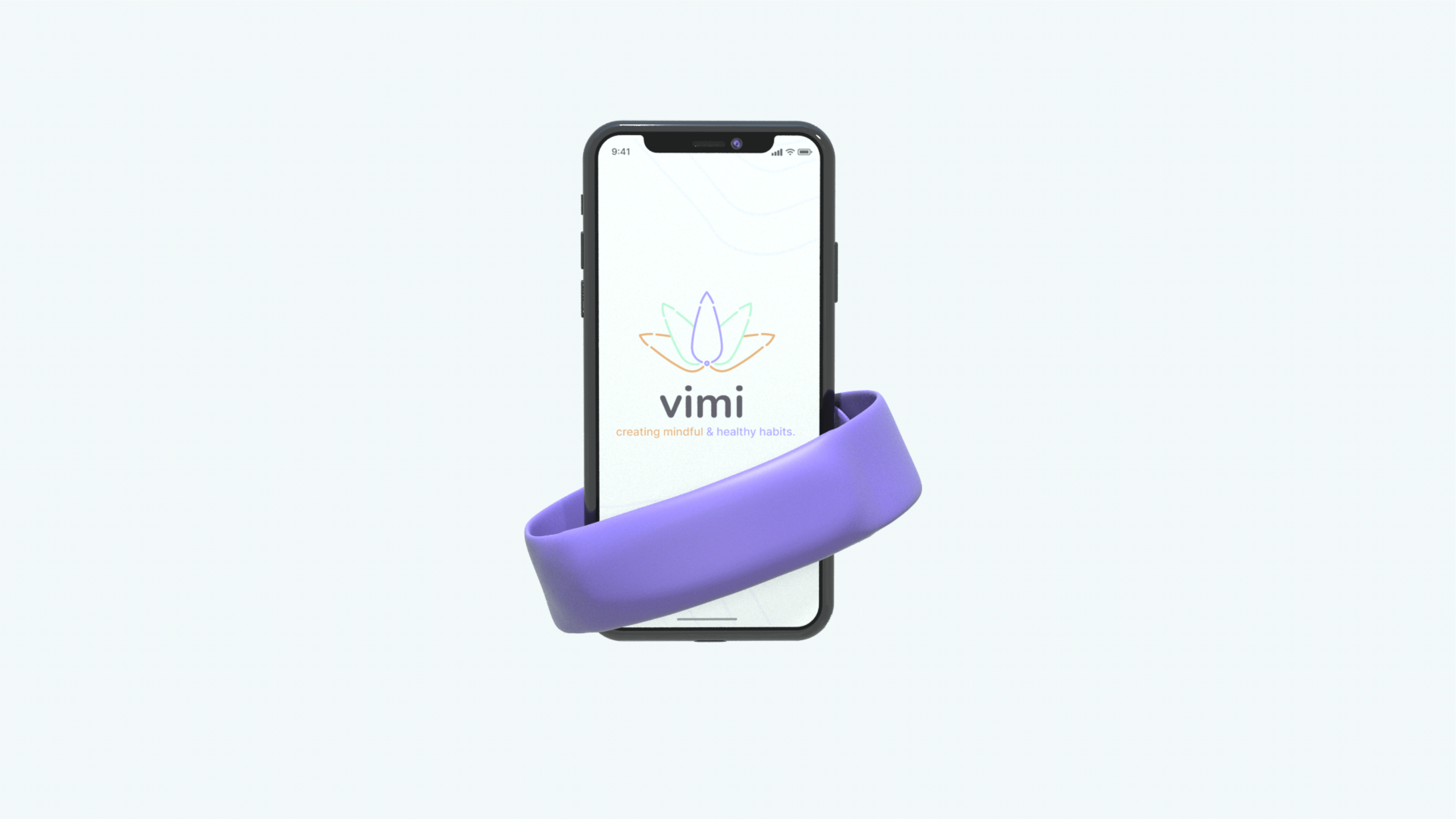
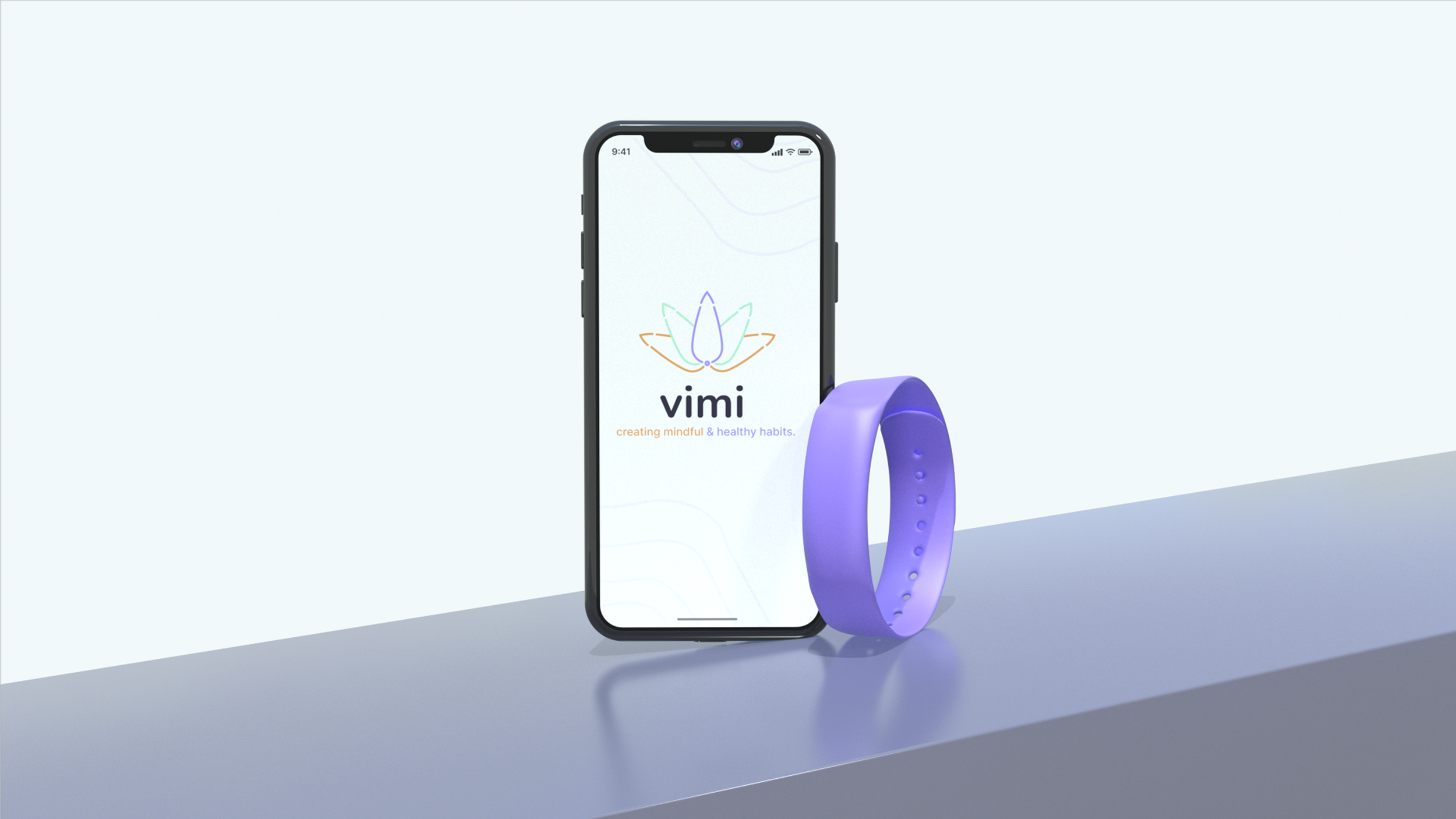
Vimi
Creating mindful & healthy habits.
Vimi is a proof-of-concept project that Elley Ellison and myself created. We combine the technology of tracking individual biometrics, with the traditional Chinese technique of acupressure. This allows you to have a direct emotional and physical impact on your overall health.

Guidance
Guide users through an anxiety attack safely.
Healthy Habits
Help users create healthy habits with the practice of mindfulness.
Resources
Provide resources, tips, and feedback to help users practice what we preach.
HOW IT WORKS
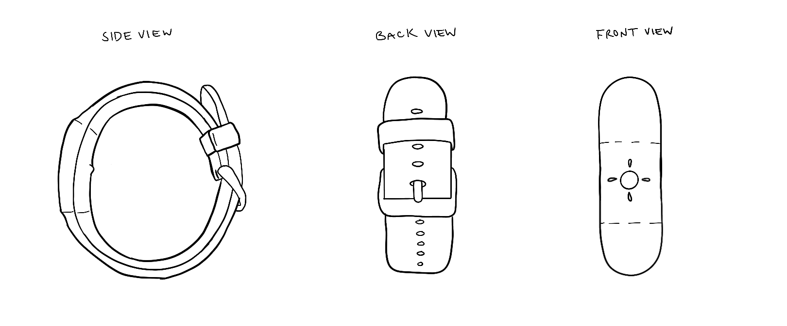
Acupressure Points
Vimi utilizes the inner fronteir, or Nei Guan (P6), pressure point. The Vimi bracelet provides sensory input and an alert to your app to remind you to utilize your pressure point.
Applying downward pressure and stimulating the pressure point for 4-6 seconds communicates with the nervous system to stimulate feel-good chemicals

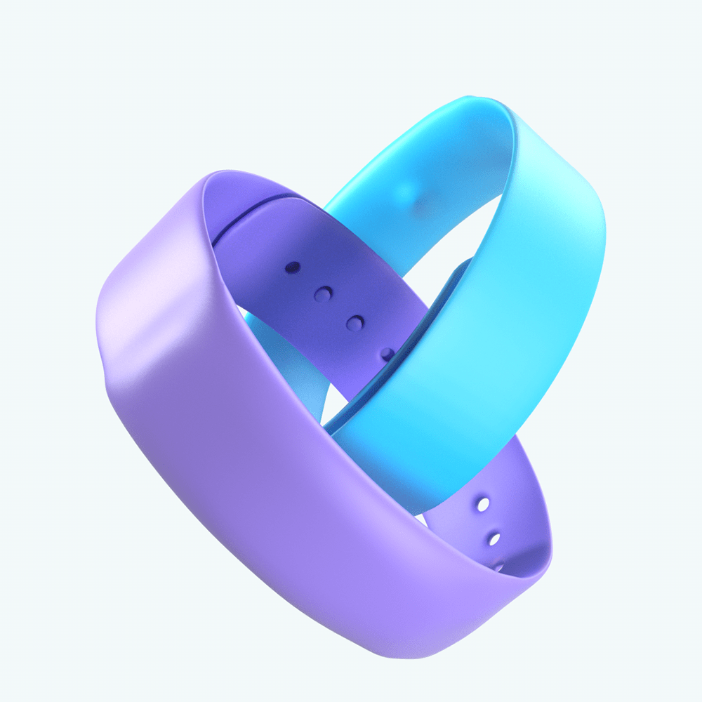
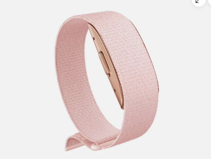
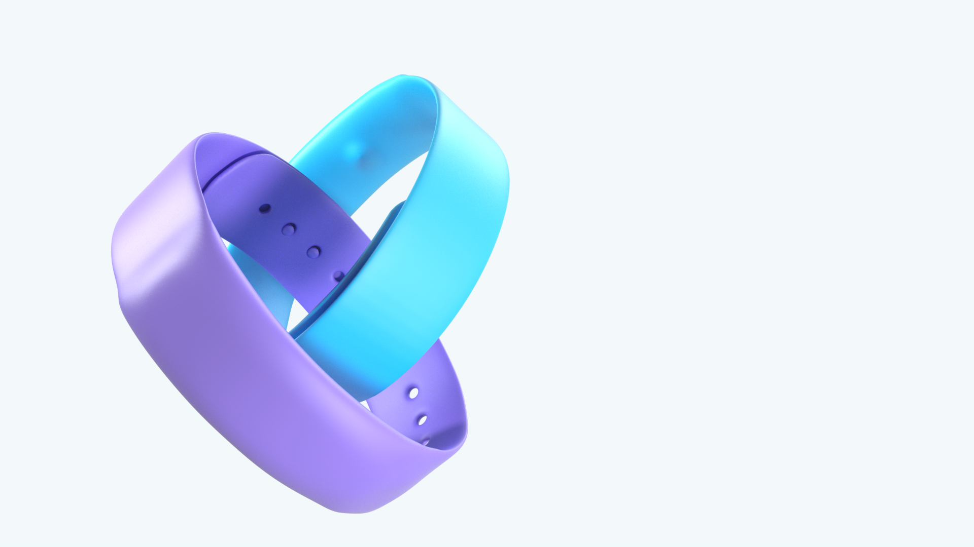
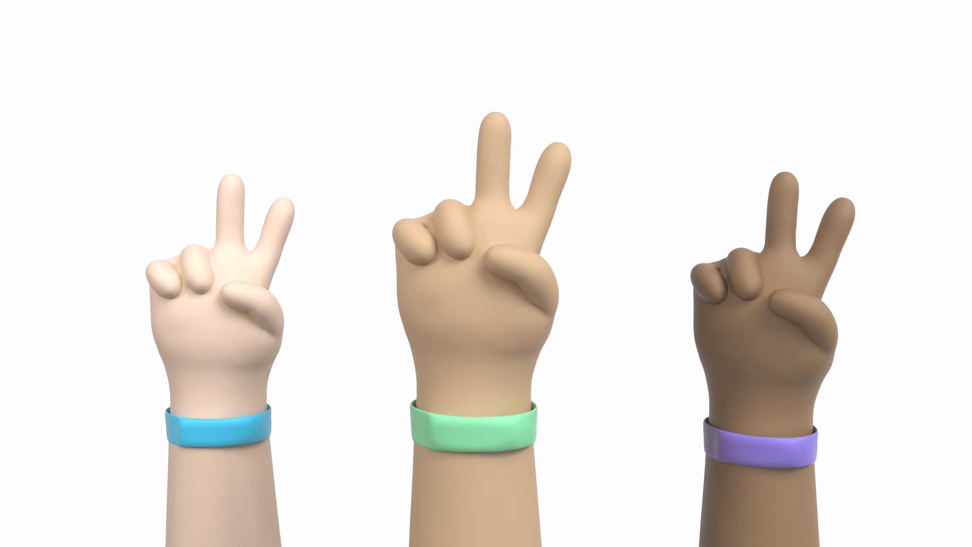
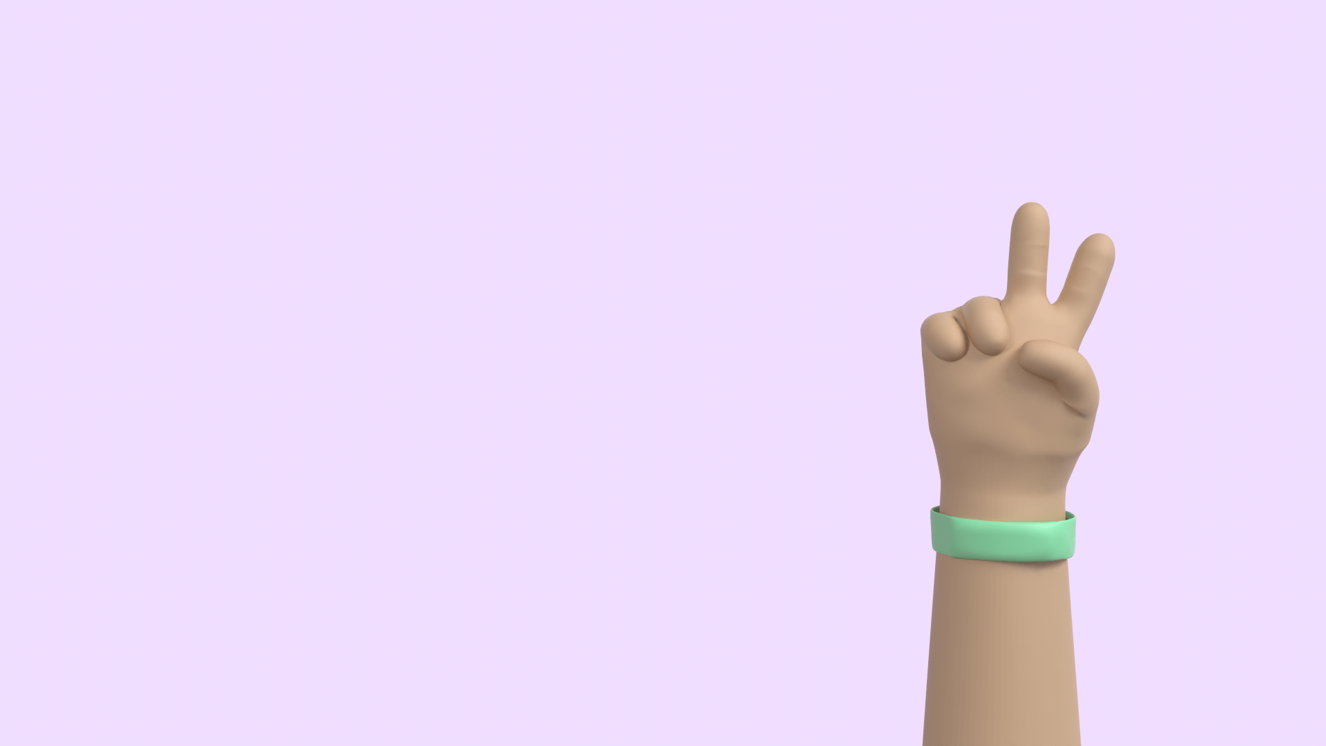
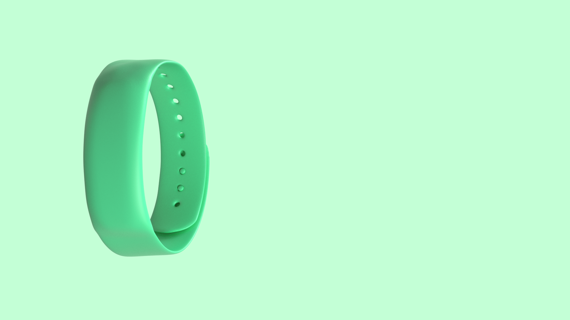
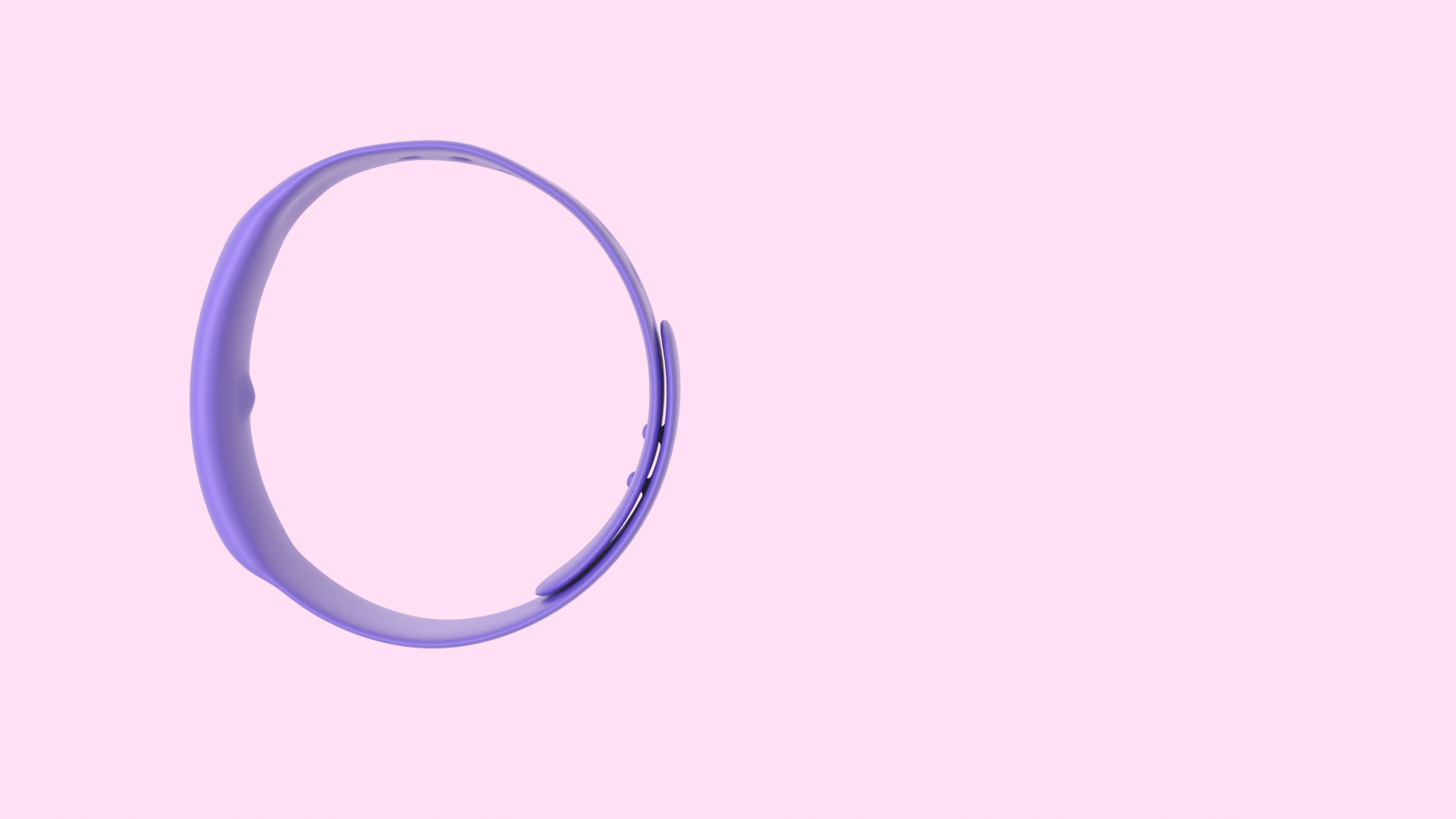
WEARABLE
Our bracelet is comfortable, affordable, and intuitive. It can recognize an anxiety attack in seconds, and evoke gentle steps to help you take action.
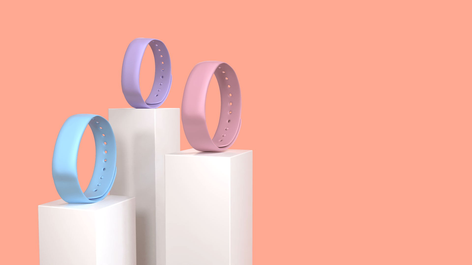
Vimi Bracelet
We take the guess work out of finding your P6 pressure point with our slightly raised acupressure nib.
Intuitive
Simple
The simple and easy-to-use clasp is adjustable for wrists of all sizes.
Made from medical grade silicone, our bracelet is comfortable to wear all the time.
Comfortable
TECHNOLOGY
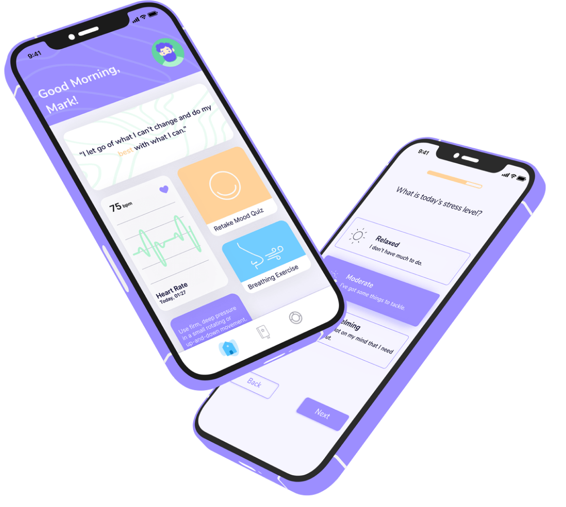
The mobile application works with you to help you make sense of your data, and take steps towards the other forms healthy habits such as breathing exercises, journaling, goal tracking, and optimism.
Mobile Application

Features
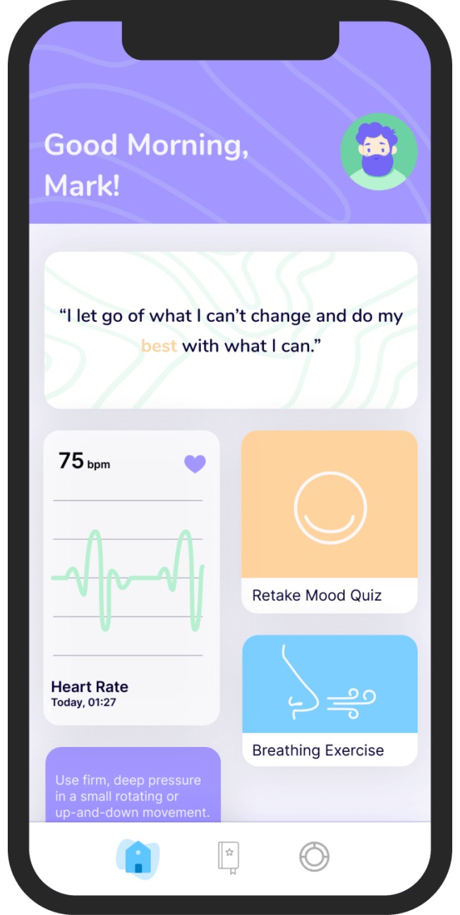
Homepage
The homepage provides all the information on one page for easy access.
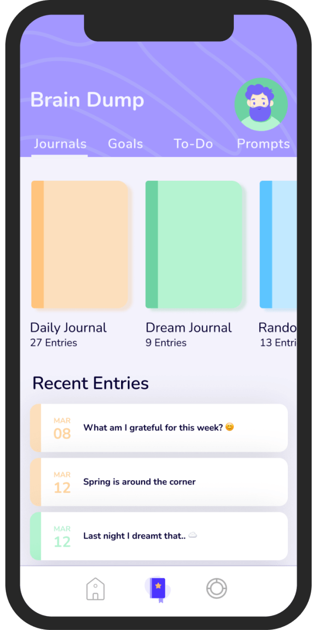
This stress-management tool helps increase your well-being and lessen feelings of distress.
Journaling
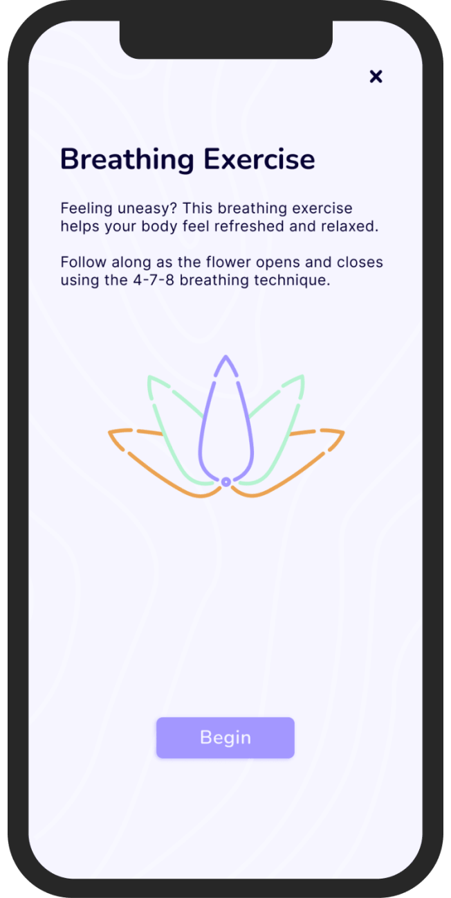
Breathing exercises bring your body back to its initial state, helping you feel relaxed and comfortable.
Breathing Exercises
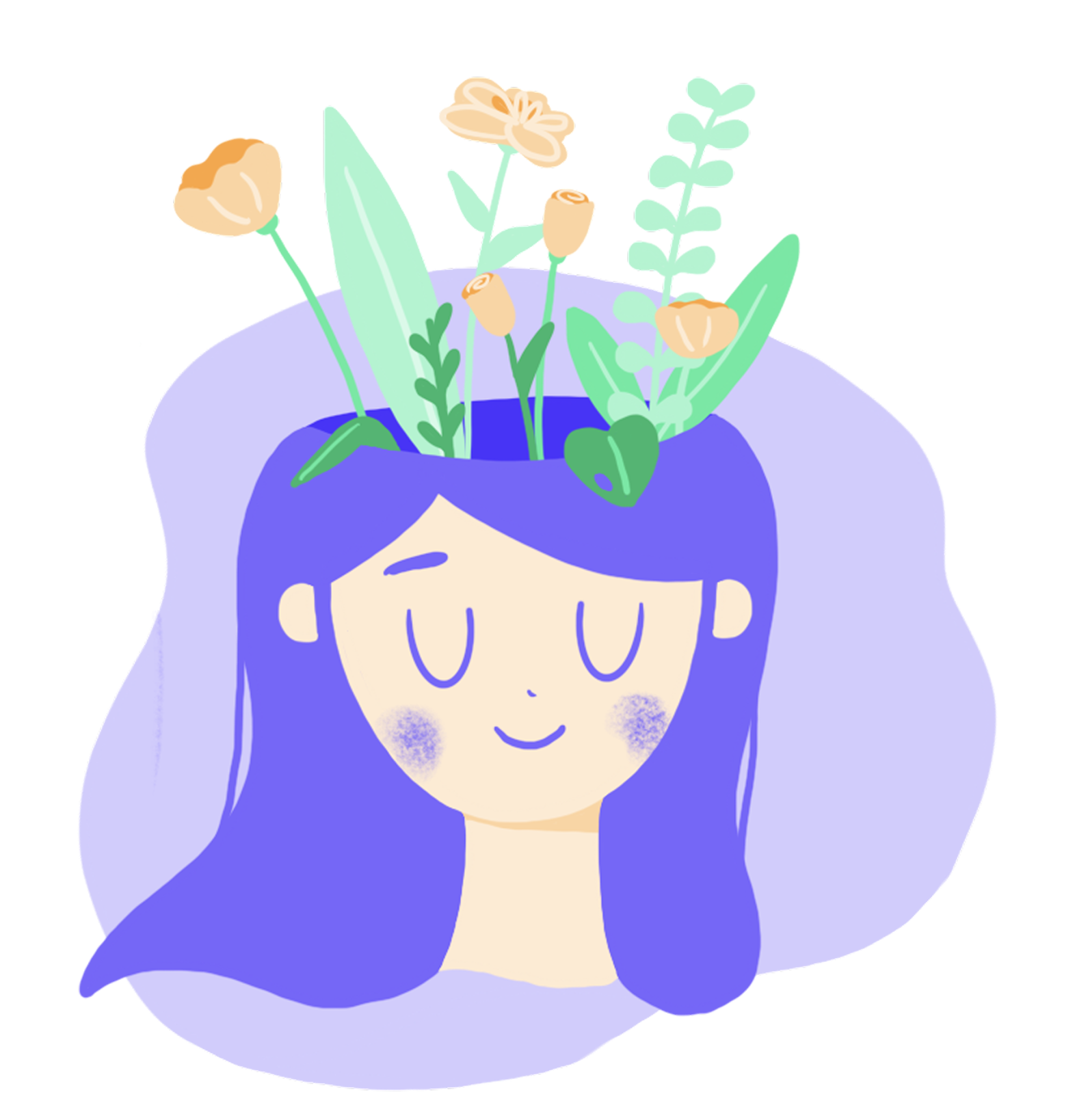
MINDFULNESS

Together, the mobile application and bracelet will provide active engagement for you, to help create those healthy habits to bring mindfulness every day.
Healthy Habits
Vimi was designed by Tessa Cote and Elley Ellison.
Team Good Vibes
MEET THE CREATORS
She/Her
Tessa Cote

She/Her
Elley Ellison
Thank you.


Project Case Study
Vimi was a year-long project built by my teammate, Elley Ellison, and me. This project held a special place in both our hearts, as we empathized heavily with our users and the struggles of mental health. We leveraged our compassion to help make a more informed product.
Problem Statement
Maintaining a healthy lifestyle and practicing self-love can be challenging when dealing with mental health issues like anxiety and depression.
Proposed Solution
Vimi proposes a future of mobile monitoring to transform our individual biometrics that engage the body toward mental mindfulness.
Project Goals
Safe space
Create a safe environment for users to explore their feelings and effectively use healthy coping skills.
Anxiety intervention
Facilitate a safe and supportive intervention for users to manage their anxiety effectively.
Practice mindfulness
Encourage users to practice mental mindfulness in order to lead a healthier and happier life.
Our Process
Discovery
Define
“How might we” statements
Persona
Journey map
Moodboard
Styleboard
Competitive Analysis
Survey
Ideate
Sketches
Lo-fi wireframes
Lo-fi bracelet renders
Hi-fi bracelet renders
Visual & Brand design
Finalize
Social media posts
Pitch deck
Product mock-ups
Website design
Discovery
As part of our discovery phase, we took a closer look at our competitors and gathered insights from a survey of 42 participants. It was an exciting journey to learn from others and understand what people think!
Competitive Analysis
At the time of this project (2021), the most comparable health technologies were classic bands that treat nausea, smart watches, and the Amazon Halo fitness band.
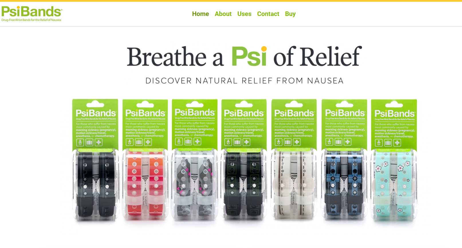
Psibands are used to treat nausea and are made of plastic and latex. They have an acupressure nib and no technological aspects.
Our competitive analysis has highlighted that the market for our product remains quite niche. We understand that navigating the world of fitness and health tracking can sometimes feel overwhelming. While many devices are available, we recognize that they often focus more on gathering and interpreting data rather than offering the support that users truly need. With this in mind, we believe that a screenless experience can help alleviate the feeling of being constantly monitored, allowing users to feel more supported and connected to their health journey.
Survey Research
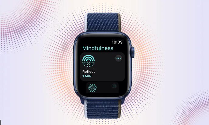
Apple Watches act as an extension of an iPhone and allow for more biometric tracking. They have some meditation features.
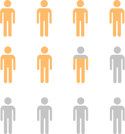
We surveyed 42 people about their mental health and what (if any) types of wearable technology they used.
Survey of Mental Health

62%
of respondents have experienced anxiety attacks

60%
of respondents did not seek help for their mental health
57%
of respondents struggled to maintain healthy coping mechanisms
Our analysis reveals a significant need in the market for our product. It's concerning to note that more than half of the participants have experienced anxiety attacks and struggle with effective coping mechanisms. Sadly, many haven't yet reached out for help with their mental health, highlighting the urgent importance of our solution to support those in need.
Why we don’t use wearable technology
Survey of Wearable Technology
Why we use wearable technology

Tracking
Respondents who use wearable technology stated that they did so to track their sleep, exercise, and other vitals.

Expensive
Respondents who do not use wearable technology stated that they don’t use it because they cannot afford it.

Respondents who use mental health apps stated that they do so to be self-aware, track their progress, and access resources.
Self-Monitoring

Forgetfulness
Respondents who do not use mental health apps stated it was because they simply forgot to do so.

Notifications
Respondents who use wearable technology stated that they used it as an extension of their phone.
Research Conclusions

Data is helpful to conclude from, but intervention and support are best.
Comfort is essential to users, especially those hyper-aware of their bodies.
Cost and maintenance can pose challenges for some users.
Biometric input enhances the convenience of building routines and tracking habits
Prompts and reminders are particularly beneficial when users are experiencing high stress.
The Amazon Halo is a health and fitness tracker without a display. It does not utilize acupressure points or provide feedback to the user.
Unaware
Respondents who do not use wearable technology stated that they don’t use them because they didn’t know they existed.
Define
During the definition phase, I focused on creating design-informing models that would serve as a solid foundation for our project. I knew how important it was to have meaningful references while designing, so I developed how-might-we statements, crafted a persona, mapped out the journey, and put together a moodboard and styleboard. This approach was aimed at ensuring that our design process was as thoughtful and user-centered as possible.
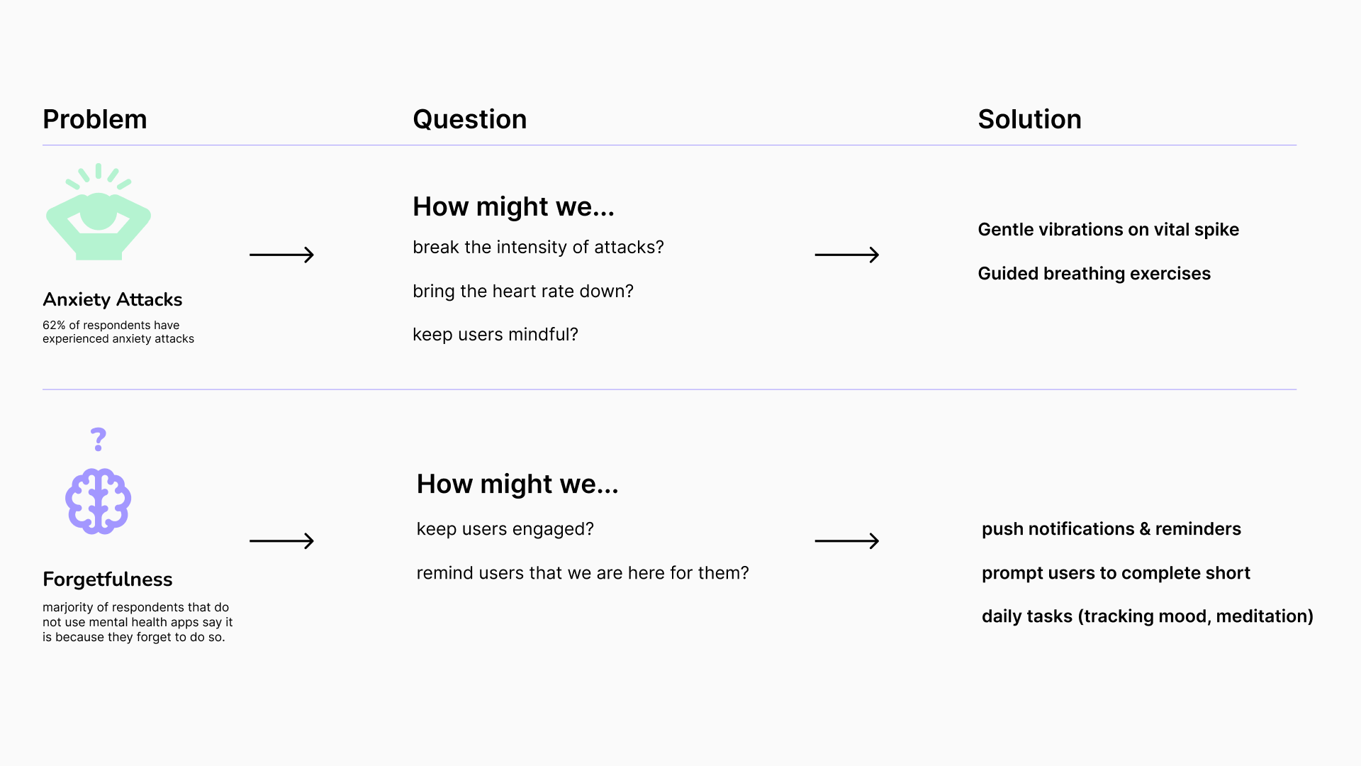
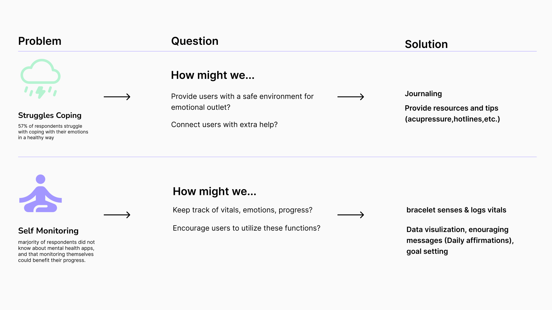
“How might we” statements
In our "how might we" statements, we focused on the key challenges identified in our survey. We recognize that issues like anxiety attack management, forgetfulness, coping, and self-monitoring can be overwhelming, and we aimed to find supportive solutions for those facing these challenges.
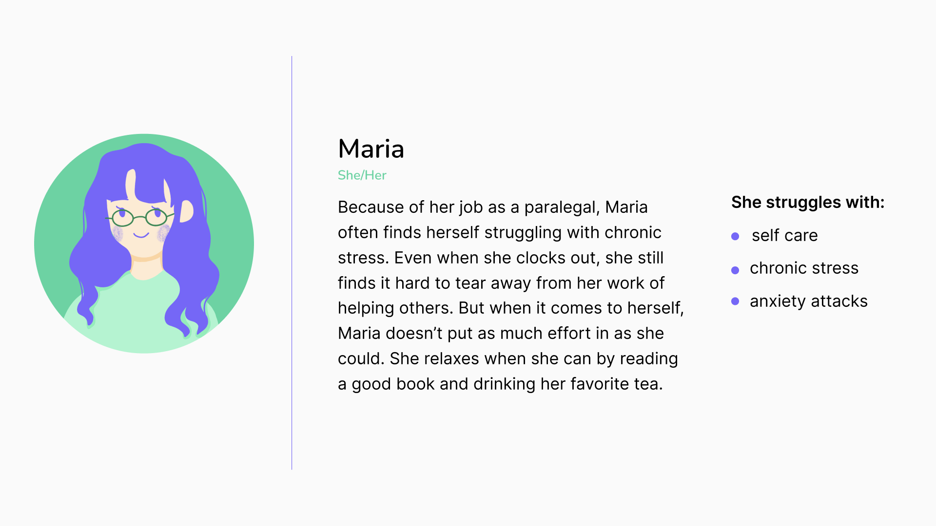
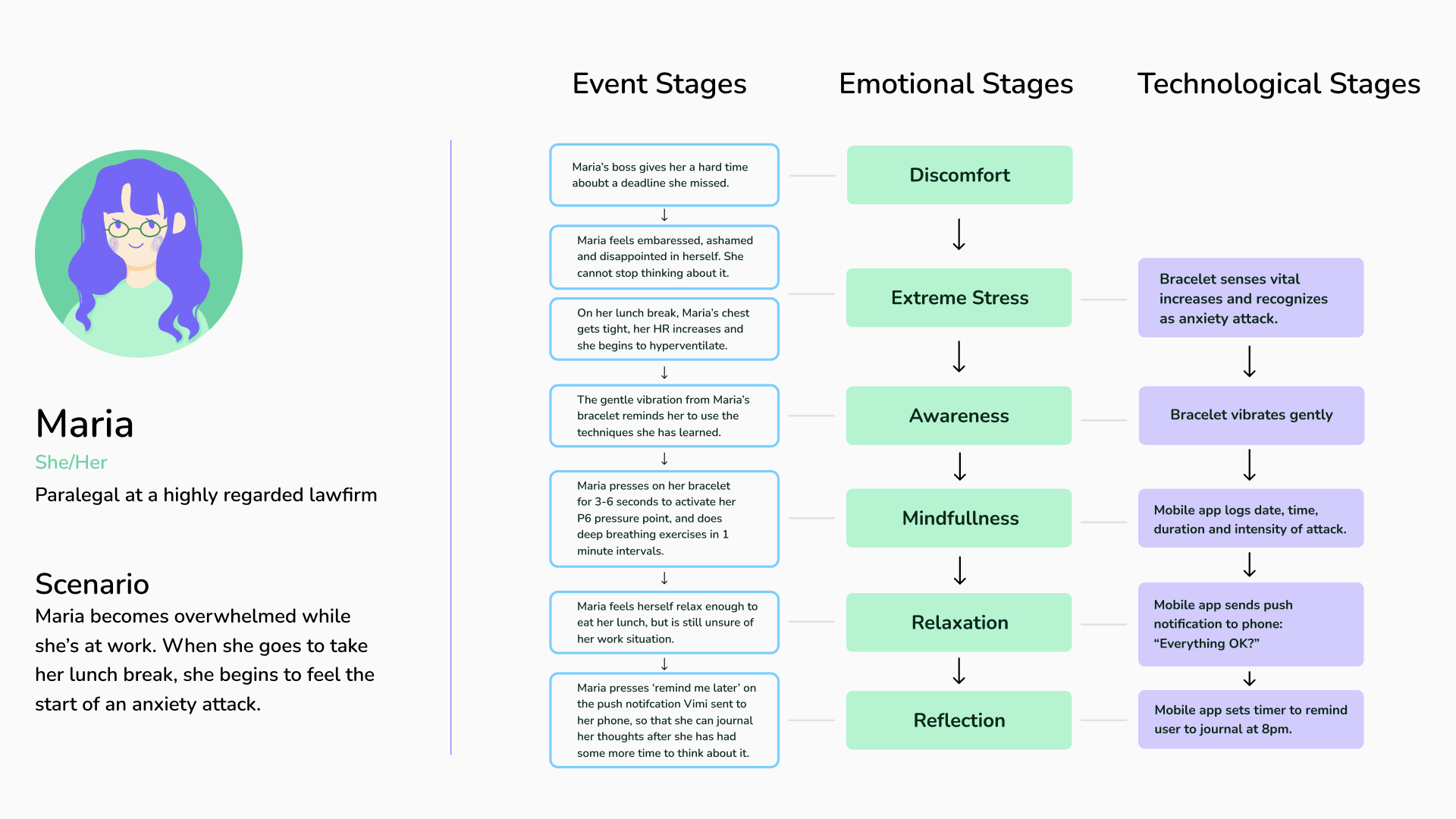
Persona & Journey map
This persona guided our journey mapping and the design of the interface and bracelet styles. In this journey map, I aimed to illustrate how Maria’s situation evolved and how her emotions were impacted, while also showcasing how the Vimi bracelet and app could provide her with valuable support.o highlight how the Vimi bracelet and app could offer meaningful support and understanding during her journey.
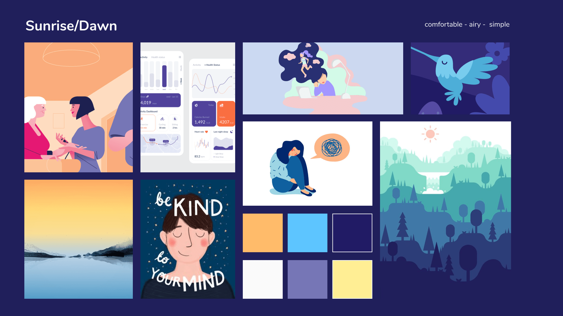
Mood board & Style board
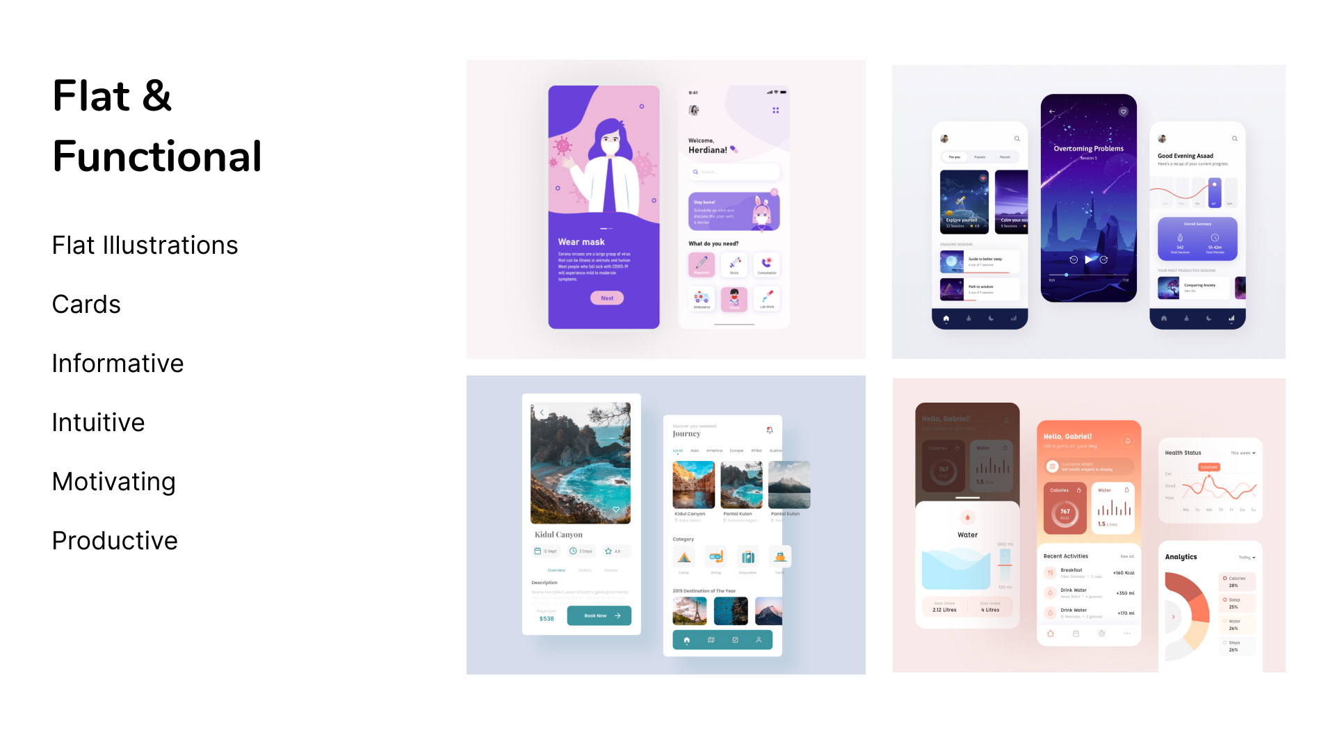
In developing the mood and style boards, I aimed to create a calming color palette complemented by vibrant pops of color. I also focused on an organic and relaxing illustration style. The user interface draws significant inspiration from dashboards, utilizing cards to segment data into easily digestible pieces.
Ideate
During the ideation phase, I concentrated on creating sketches of the mobile app and bracelet, 3D renders of the bracelet, and overall visual and brand design for Vimi.
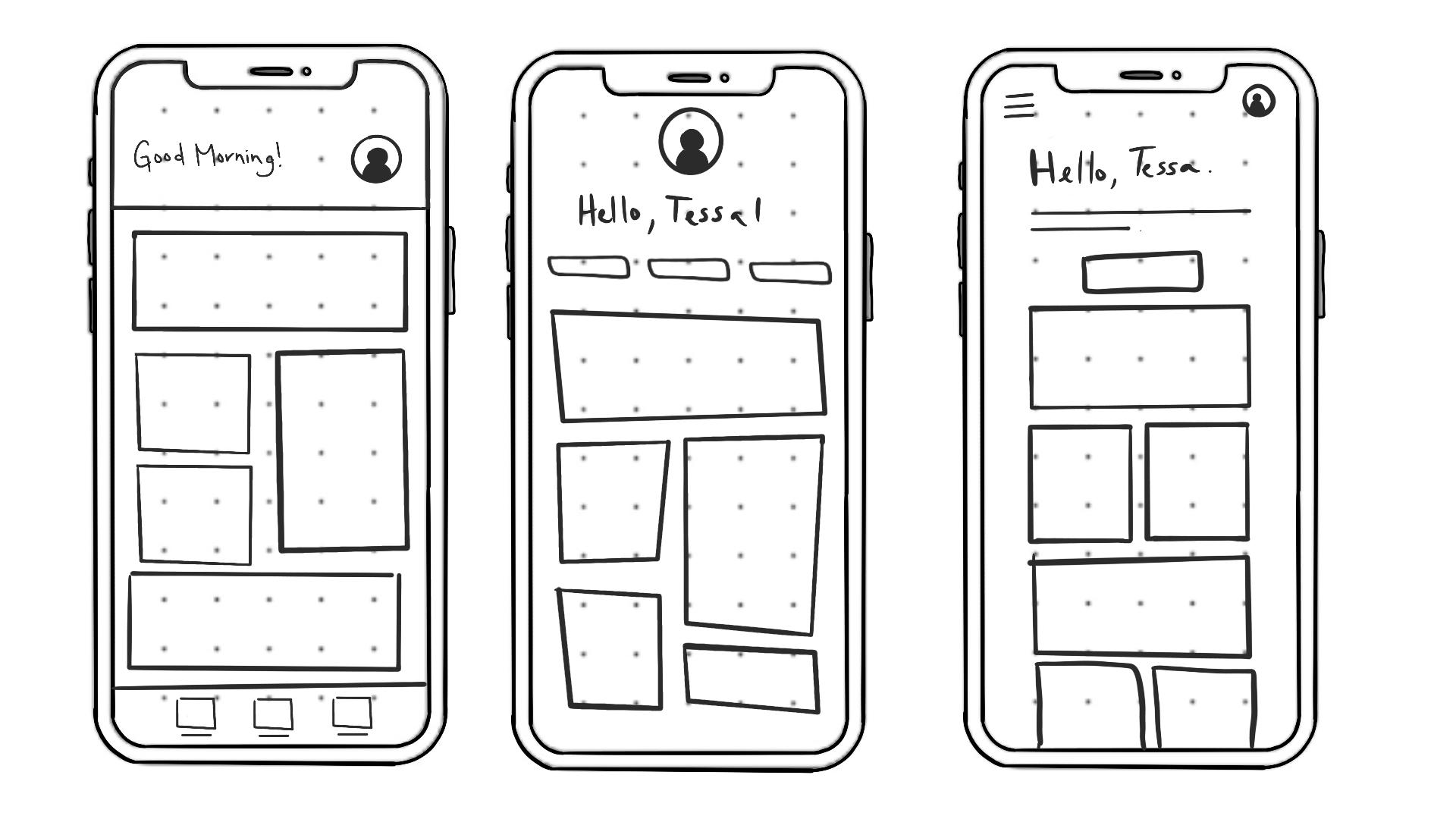
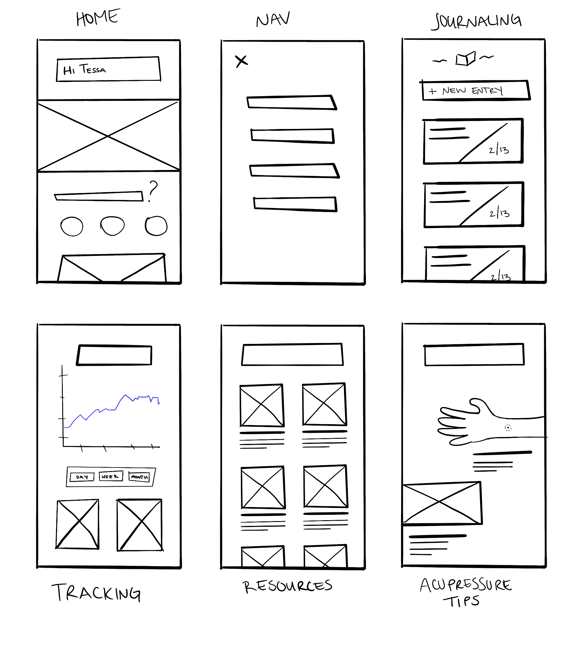
Mobile App sketches
I started by sketching the mobile app to create a clear layout and identify key features. I realized we could present goal and progress tracking in various engaging ways for users to easily monitor their journeys.
We prioritized the journaling feature, allowing users to quickly explore and express their thoughts. I also sketched a resources page with helpful information, acupressure tips for quick relief, a user-friendly navigation system, and an inviting homepage to enhance the overall app experience.
Bracelet sketches and renders
In my sketches of the bracelet, I aimed to explore the clasp design and how it could fit comfortably on the wrist while being nearly unnoticeable. Initially, I considered a pin buckle clasp, which is a familiar choice; however, it can also be clunky, uncomfortable and inacessible.
I found inspiration in Disney’s MagicBands, which are designed for long-term wear and feature a unique, peg-inspired clasp. This design allows the entire bracelet to be made of silicone, providing added comfort for the wearer.
I modeled the bracelet in Cinema 4D based on my sketches and experimented with different textures and thicknesses. It was an intriguing challenge to transform something that existed only in my mind and on paper into a tangible digital 3D creation.
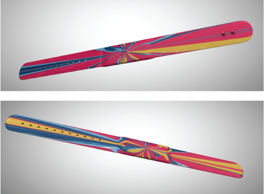
Bracelet Style-frames


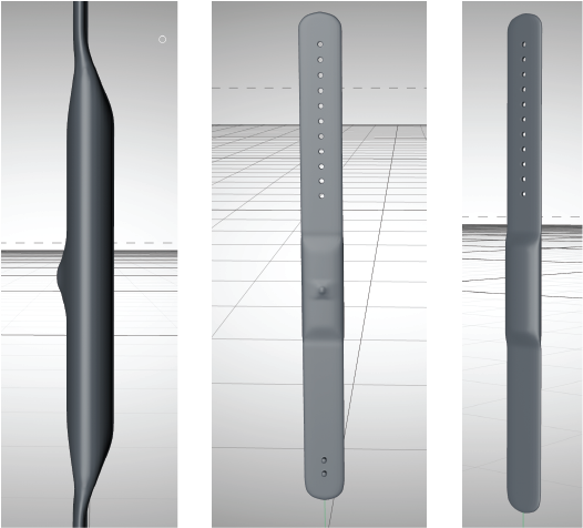
I worked on rendering various views of the bracelet. I experimented with its composition, considering how it might look on a wrist and how it would appear paired with a phone. It was a unique challenge to render the hand models smoothly, avoiding the appearance of "sausage fingers," while making an otherwise plain bracelet appear more interesting. To provide additional context and visual appeal, I used props such as pedestals or paired the bracelet with a phone or hand model.
Visual & Brand design
My goal was to create a calming and supportive brand identity by developing soothing color palettes, harmonious typographic combinations, intuitive UI elements, and a memorable logo that reflects the essence of the brand.
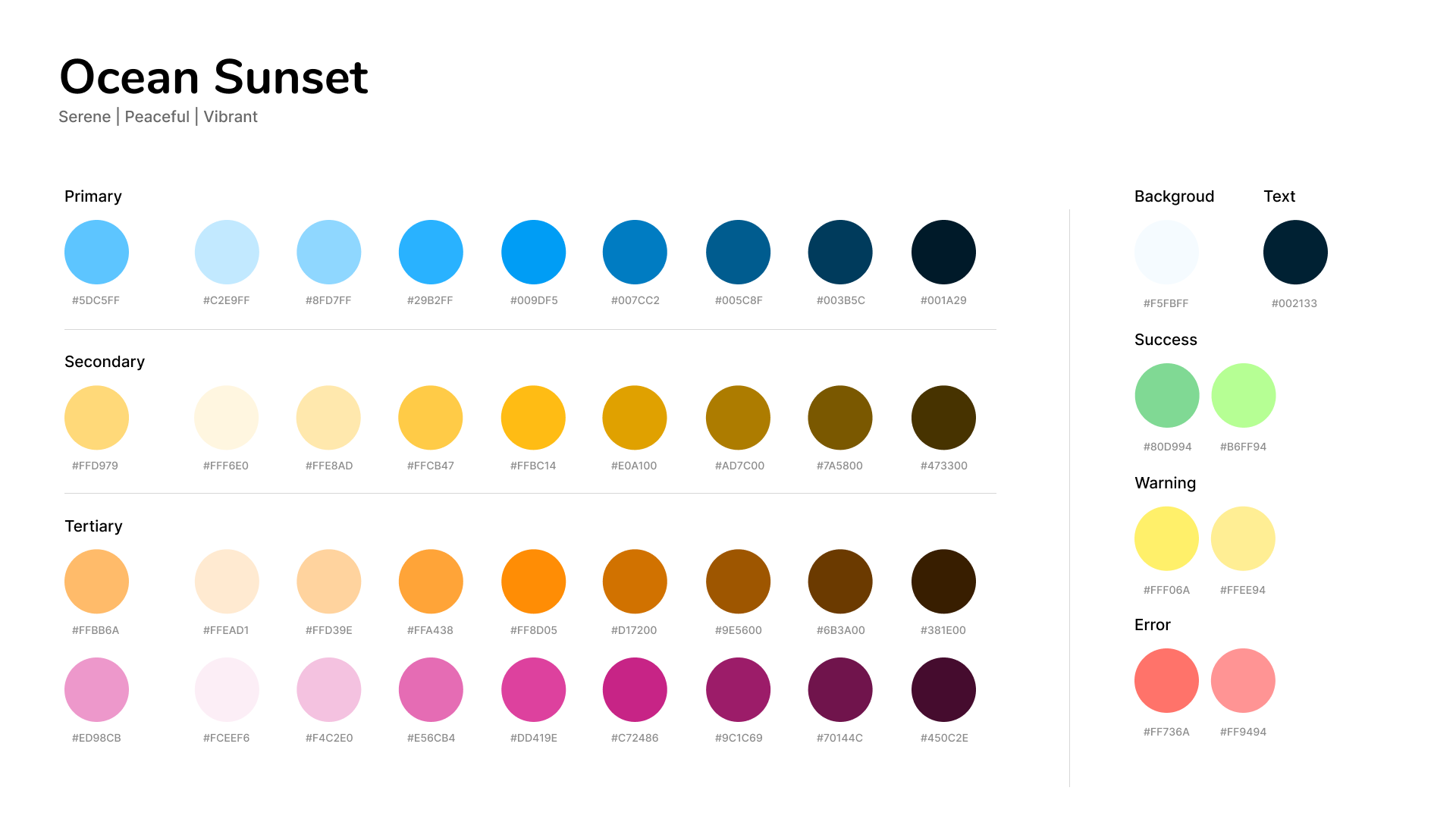
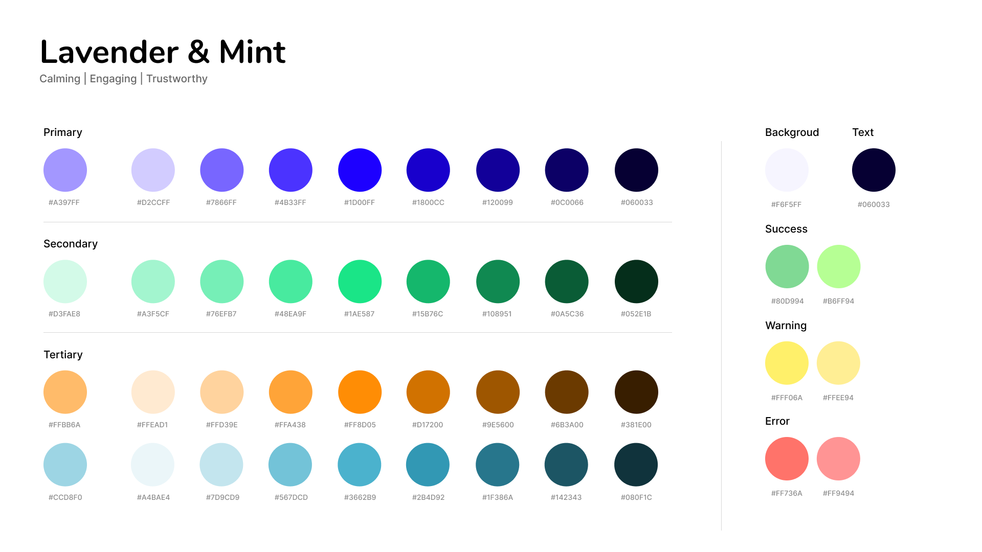
Color palettes
I created two color palettes that both focus on muted blue and purple as the primary colors to evoke feelings of calmness and trustworthiness. I complemented these palettes with brighter colors like yellow and orange, reminiscent of the sun, to enhance feelings of happiness and positivity.
Typography
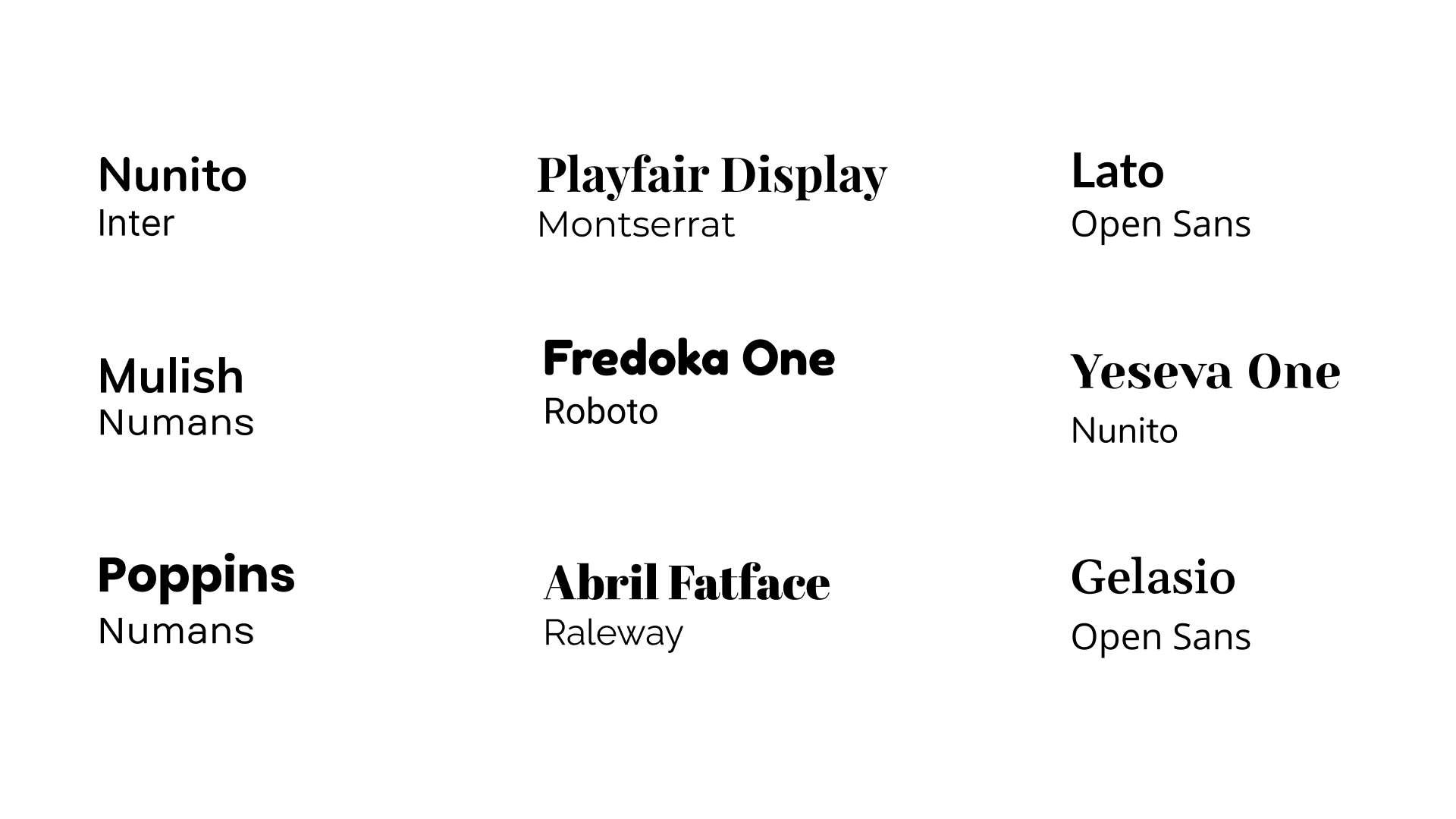
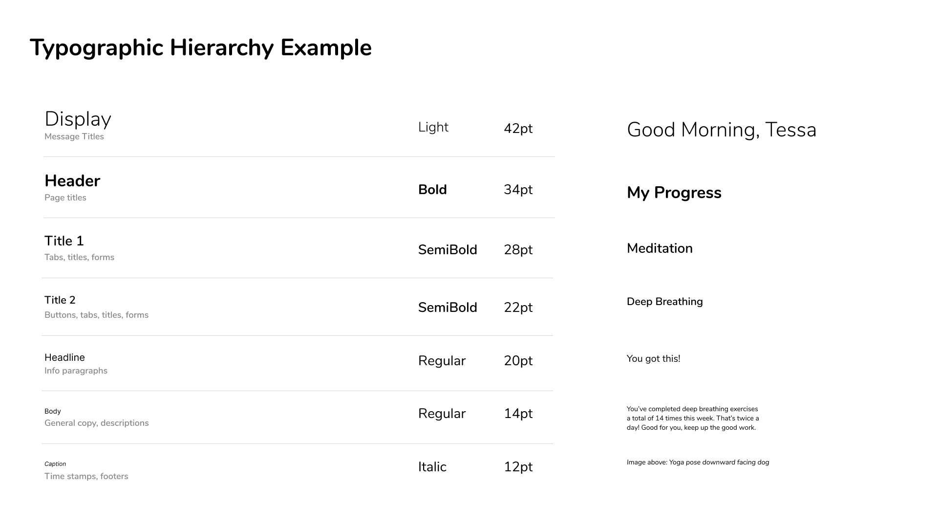
I took the time to explore different typographic combinations for our brand, as well as our website and mobile app. We really wanted to create a feel that is both rounded and bubbly while still looking professional, as we believe this brings a sense of tranquility. After careful consideration, we decided that using Nunito and Inter as our font families would best convey the warmth and professionalism we’re striving for.
Want to see more design system work? Check out my project [NAMELESS] ->
UI Exploration
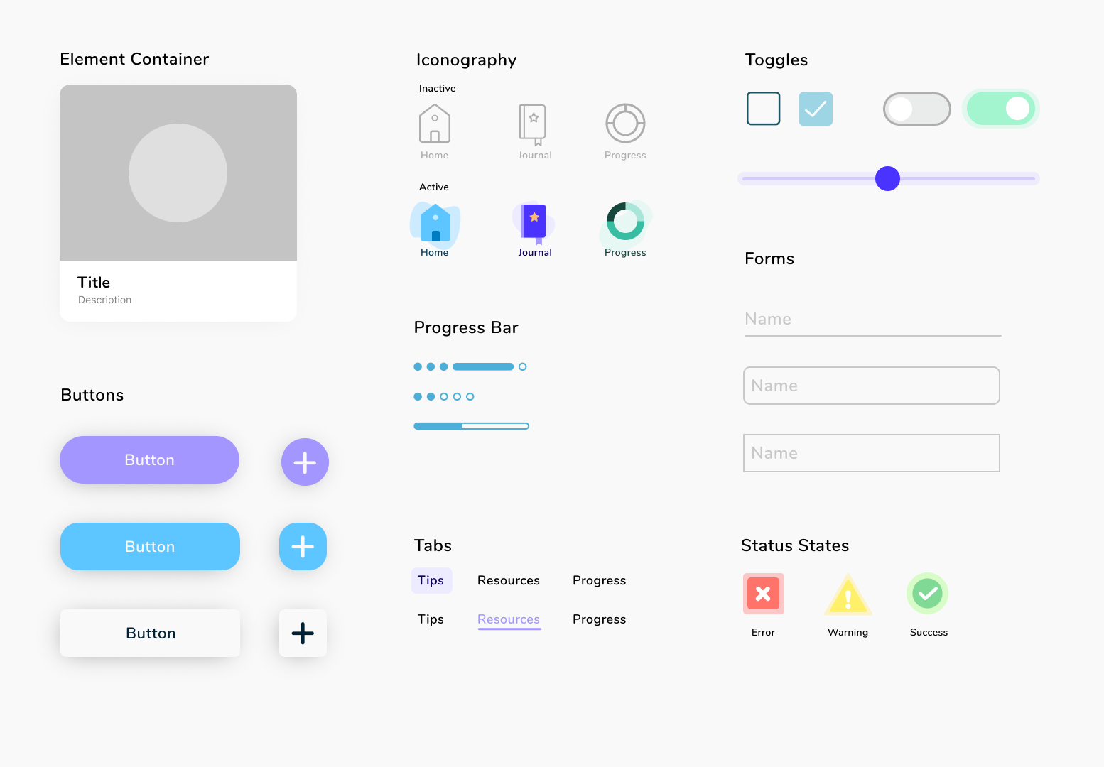
In exploring the elements most likely to be utilized in the user interface, we discovered the joy of designing various components, including buttons and tabs. This creative process allowed us to visualize the options available and assess how each one harmonized with the overall design elements. By developing a micro design system, we established a comprehensive and cohesive reference point that guided us through the intricacies of the design process. This system not only streamlined our decision-making but also promises to be an invaluable resource for future enhancements, ensuring consistency and clarity as we evolve the user interface.
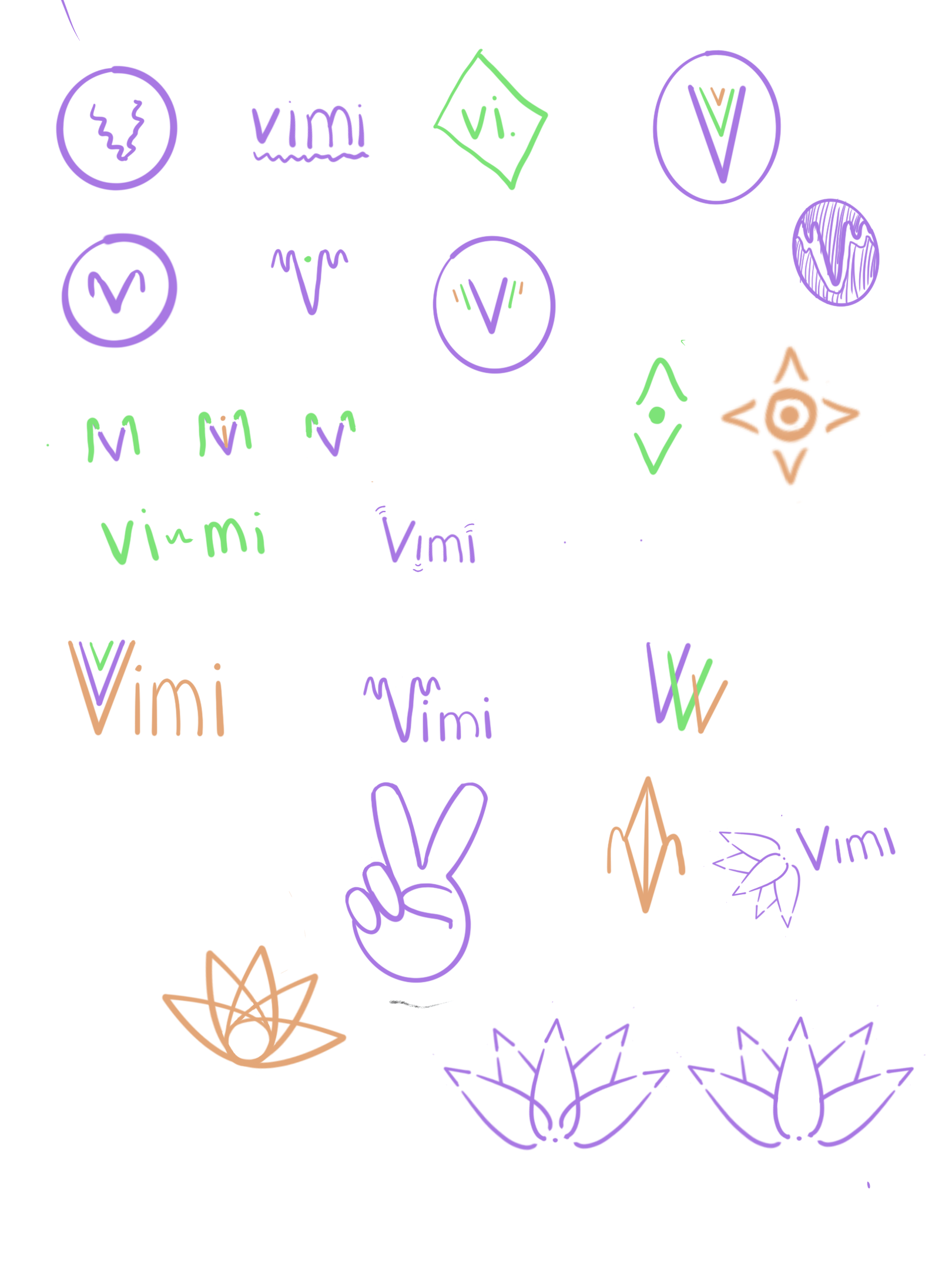
Logo Design
For the logo, I began by sketching various combinations of the letter “V” and visual representations of vibrations. However, none of these designs felt intuitive enough. I then shifted my focus to symbols that captured the essence of the brand, which is centered around mental wellness. This led me to explore different interpretations of the lotus flower. The lotus flower symbolizes rebirth and purity, as it blooms in the muddiest and most unlikely conditions. This concept resonated deeply with the idea of the mental health journey: “We grow through what we go through.”

Finalize
In the final phase, I worked on designing our product website, creating final product mock-ups, developing our pitch deck, producing the final video, and collaborating on social media posts.
Product website
For our final website, Elley and I worked closely together to design the layout and content. We compared sketches, gathered our assets, and established the main purpose of the page: to educate and advertise.
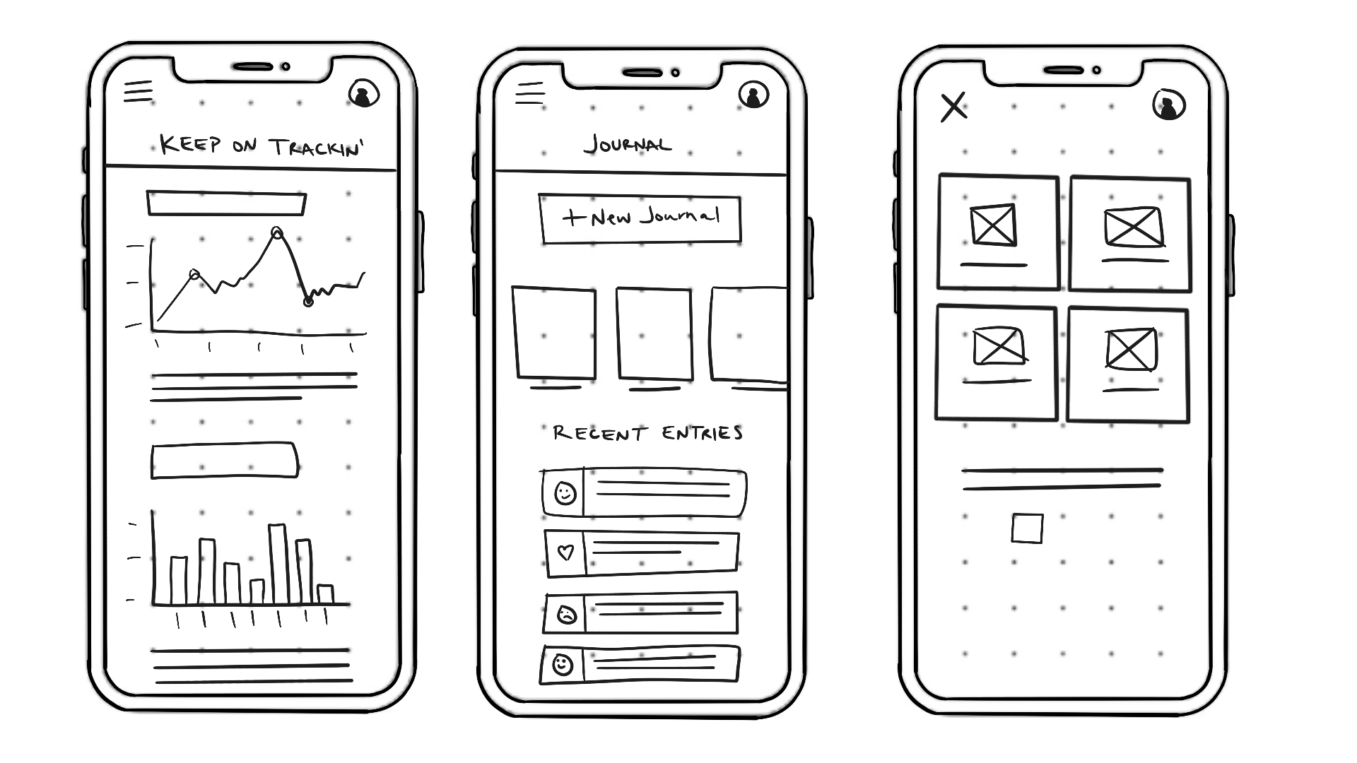
Final sketch
Mid-fidelity wireframe
Final Wireframe