Member Benefits Redesign
When members log into their insurance web portal, they expect to find the information they need quickly and efficiently. When they find that information, it should be easy-to-understand and leave them feeling confident in their plans coverage.
What are Member Benefits?
The Member Benefits section helps members understand what services their insurance plan covers and what costs they may owe, accessible from the main navigation and dashboard. Although the benefits section provides members with essential coverage information, difficulties using it make it one of the biggest call drivers to customer service.
Problem
Members using the Excellus web portal struggled to find and understand their benefit and coverage information, leading to increased customer service calls.
Process Overview
1.
5.
Test the current experience
2.
4.
Create design informing models
3.
Build lo-fidelity prototypes
Test our prototypes
Create hi-fidelity wireframes
Current State
To understand where members were getting lost, we evaluated three key areas: the dashboard, the benefit summary page, and the benefit details page.
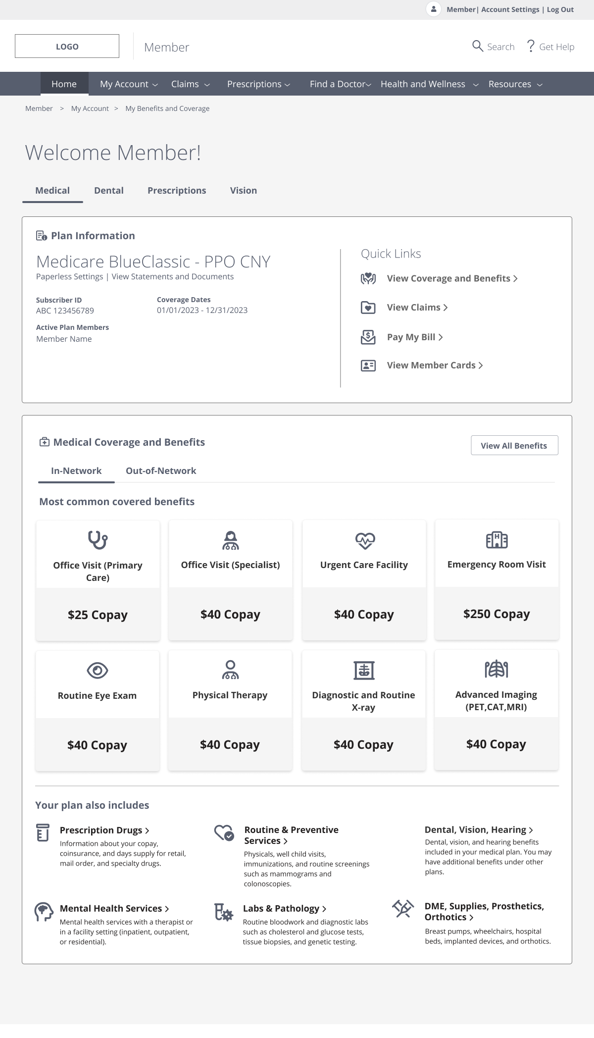
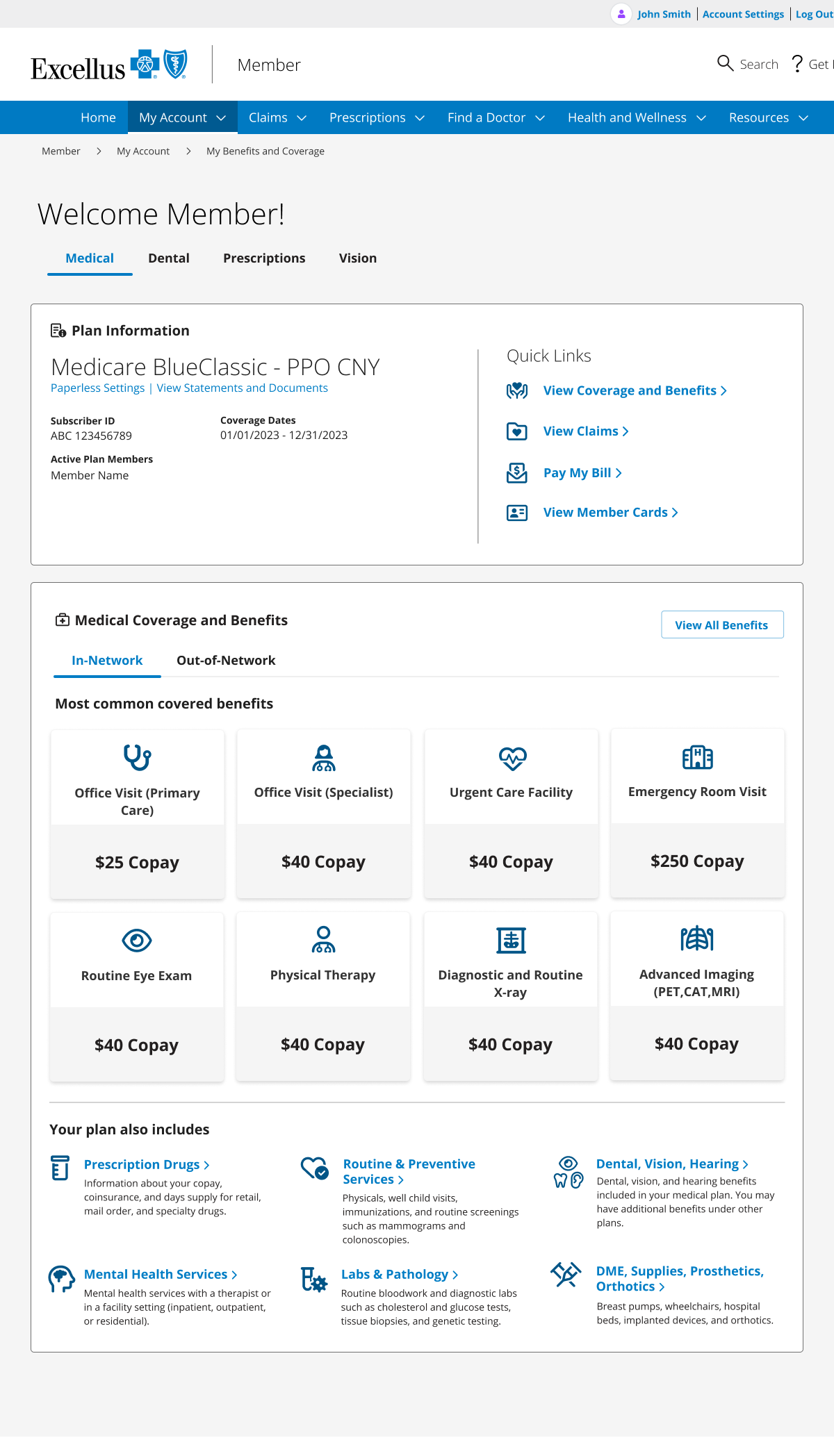
Member Dashboard
The member dashboard, one of two entry points to benefit details, shaped members’ first impression of their coverage information. Key opportunities for improvement included:
Increasing visibility of the “My Coverage” section, which often appeared below the scroll line
Reprioritizing the plan information shown
Adding a “Quick Links” section
Cleaning up the overall look and feel
Benefit Summary
The benefit summary page housed a couple PDFs and the benefit limits tracker. This page is only accessible through the navigation or breadcrumb. Key opportunities for improvement included:
Condensing and prioritizing information shown
Reprioritizing the plan information shown
Cleaning up the overall look and feel
Benefit Details
The benefit details page was the most important page, this is where all the information from the database was pulled in and displayed to the user. Key opportunities for improvement included:
Adding typographic hierarchy
Adding imagery to help with context
Adjusting the language to be more understandable
Cleaning up the overall look and feel
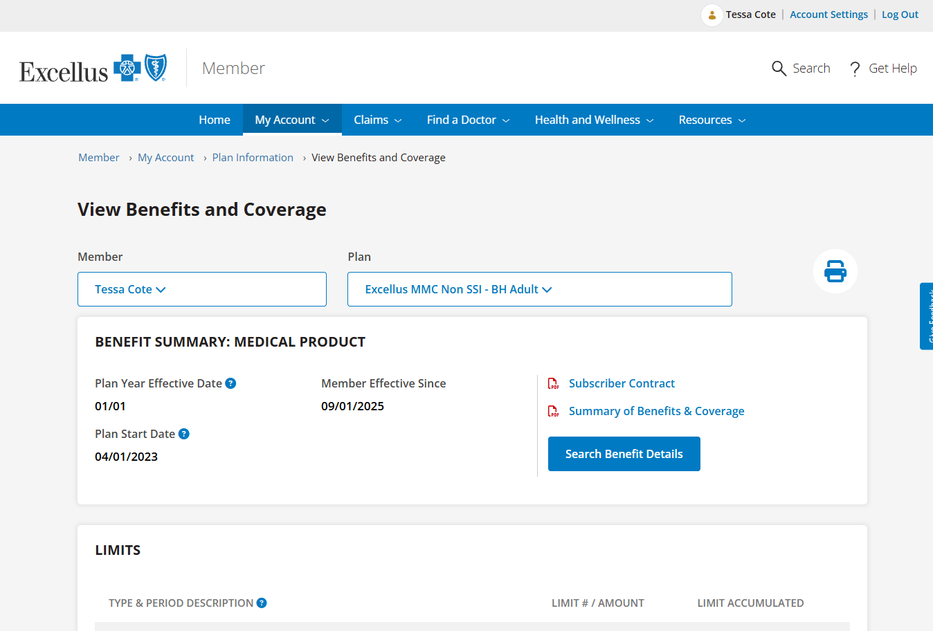
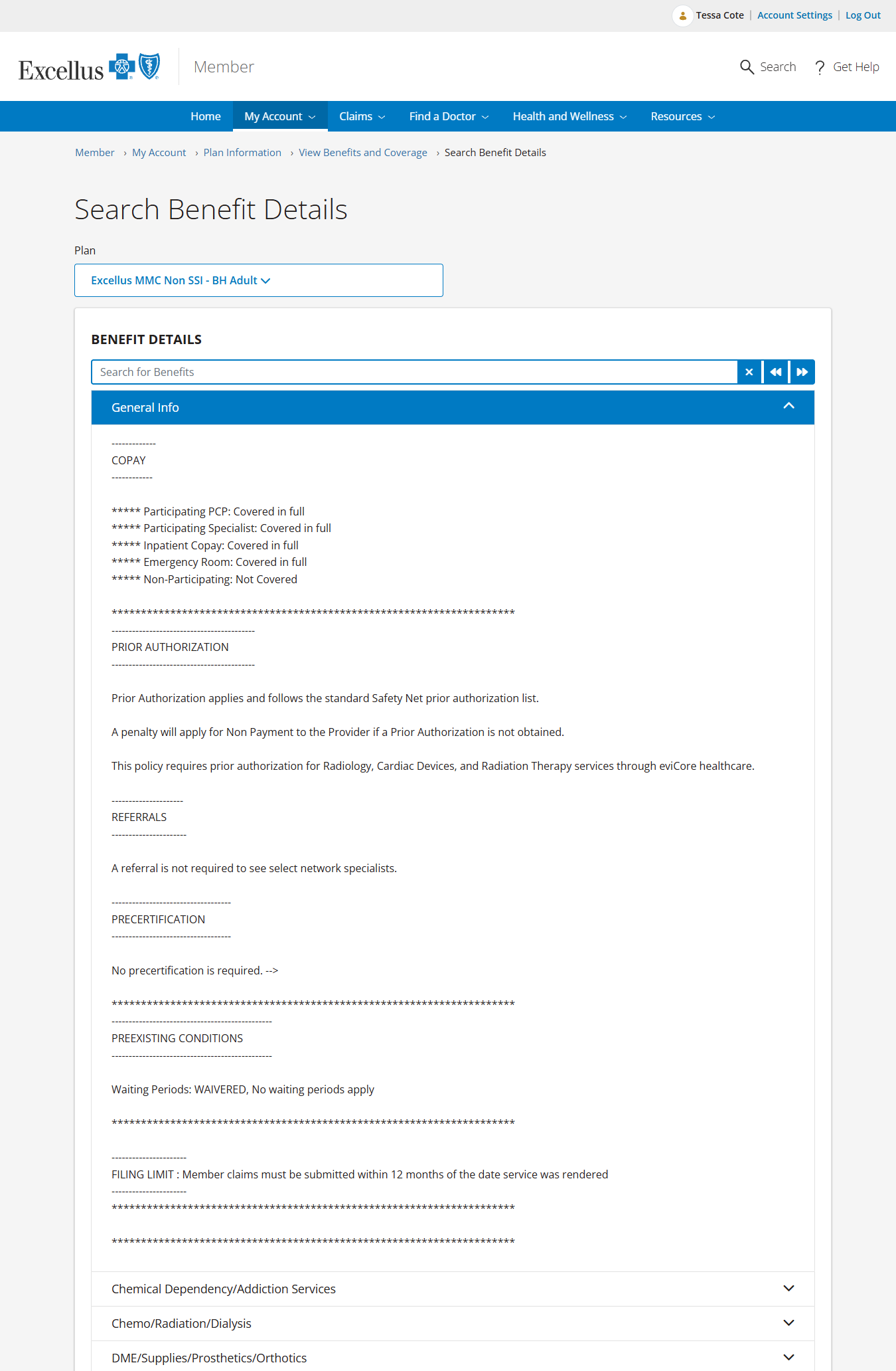
Benefit Search was determined to be out of scope for this phase of the project due to it’s complexity.
Research Insights
We conducted 16 sessions of moderated testing with three tasks to complete on the current website to determine where the biggest pain points in the experience were, and at what point members were giving up to call customer service.
1. Finding specific benefit information
2. Understanding their costs and coverage
Design Informing Models
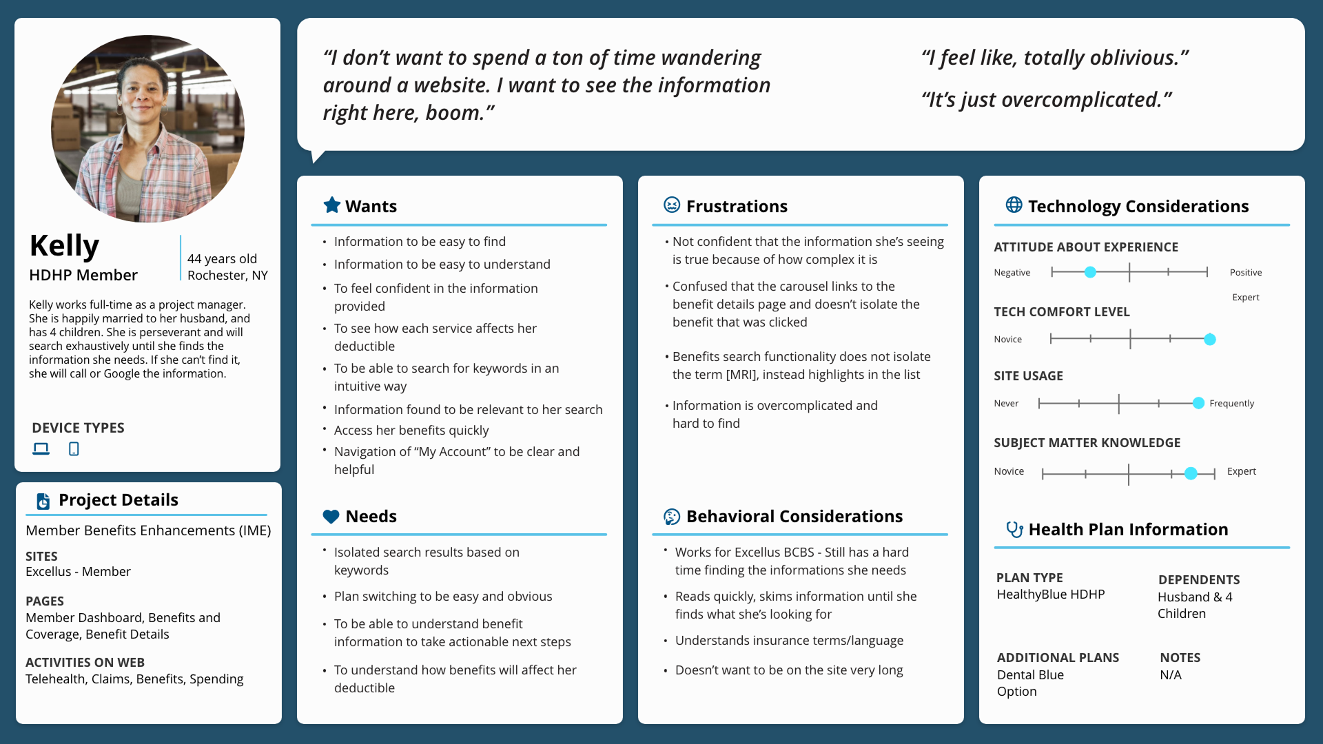
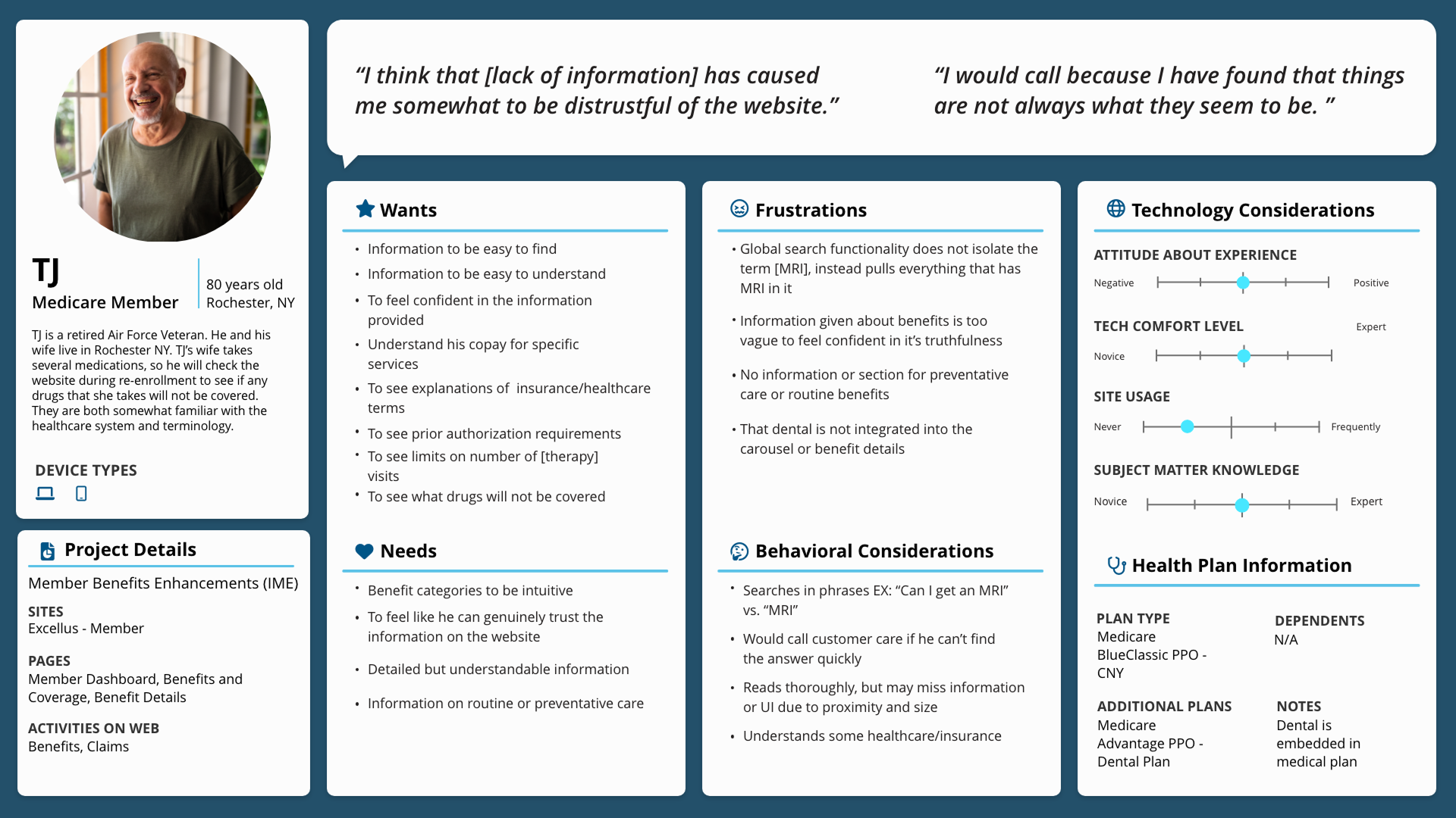
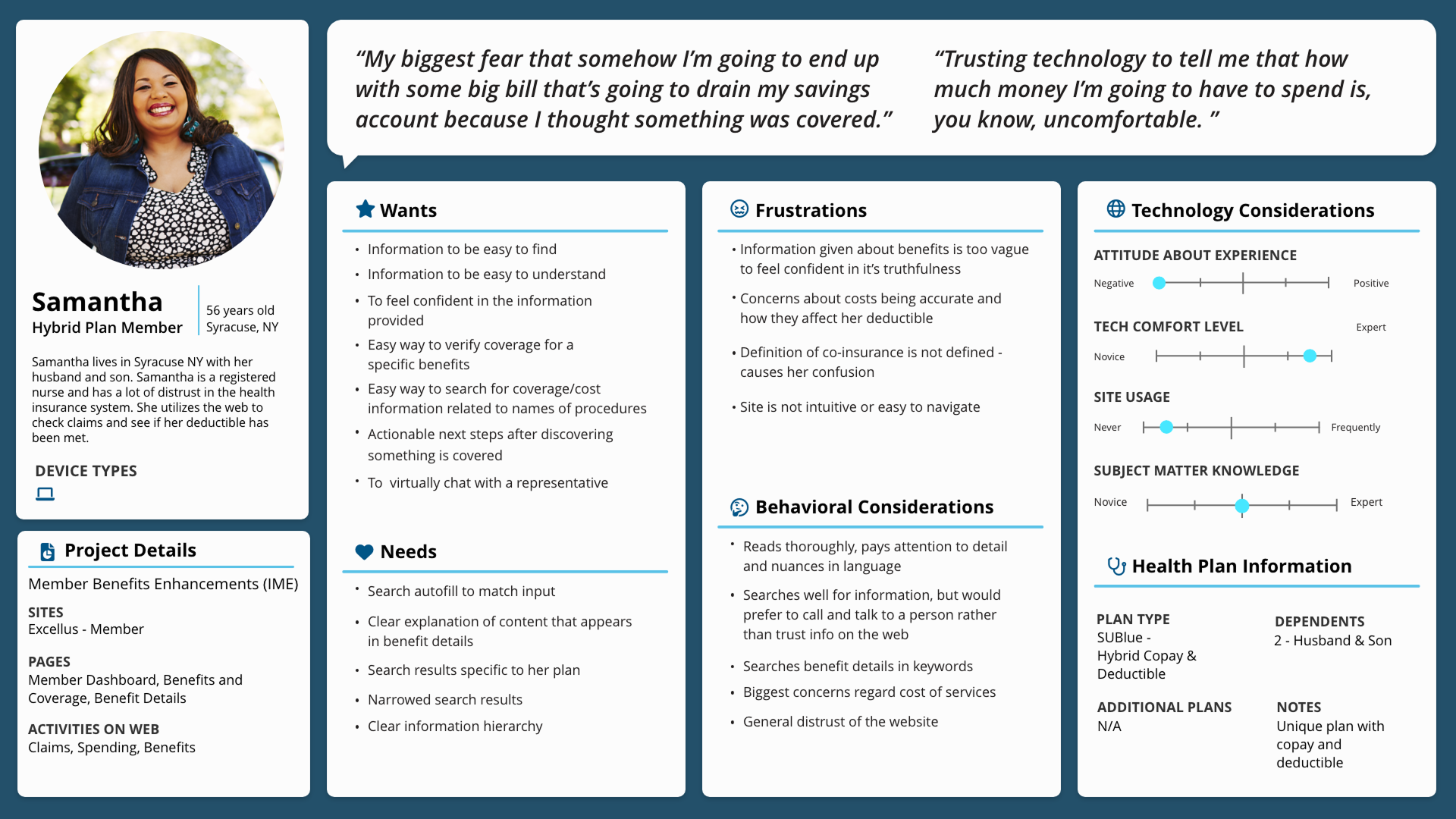
Meet our personas
Journey Mapping
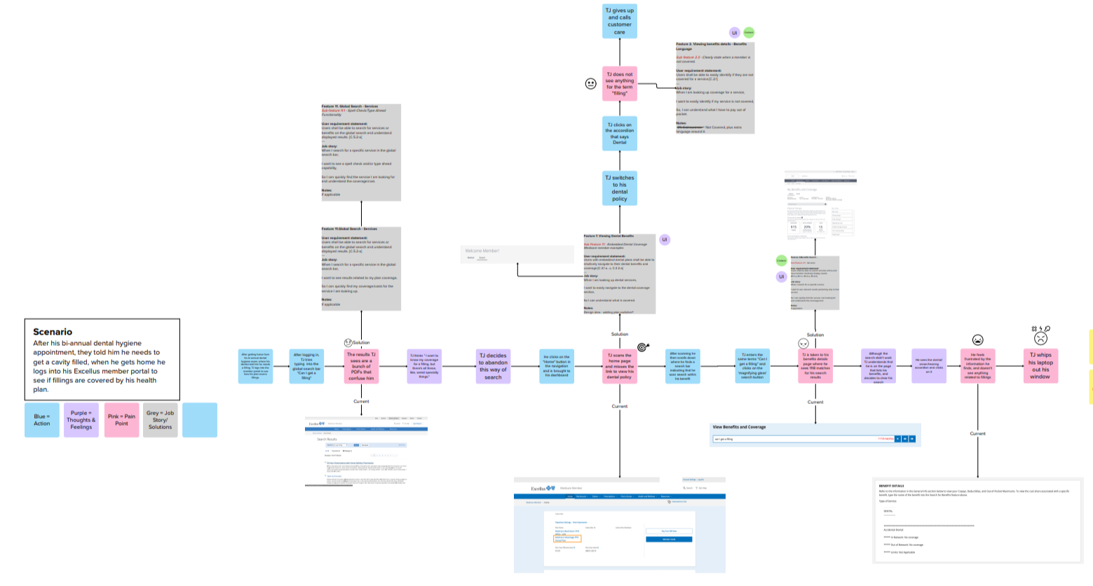
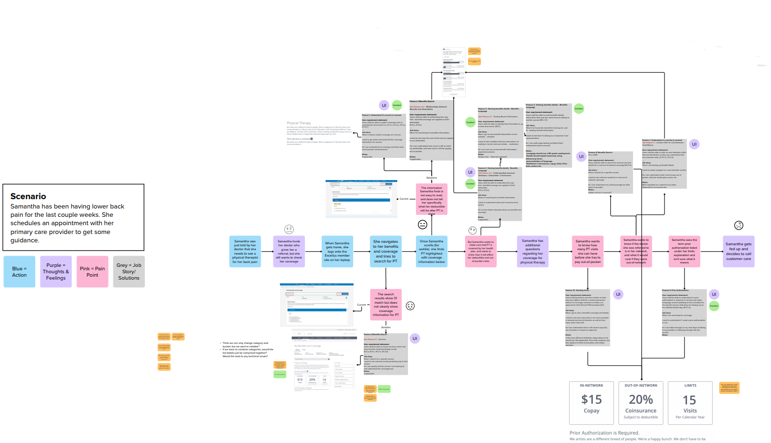
I led the project team through three journey mapping sessions. In each scenario we had our personas complete one of our research tasks to highlight what struggles they might encounter that are specific to their needs. I included the job stories we created from our research session in the journey maps so that we would have direct references to UI and pain points to refer to.
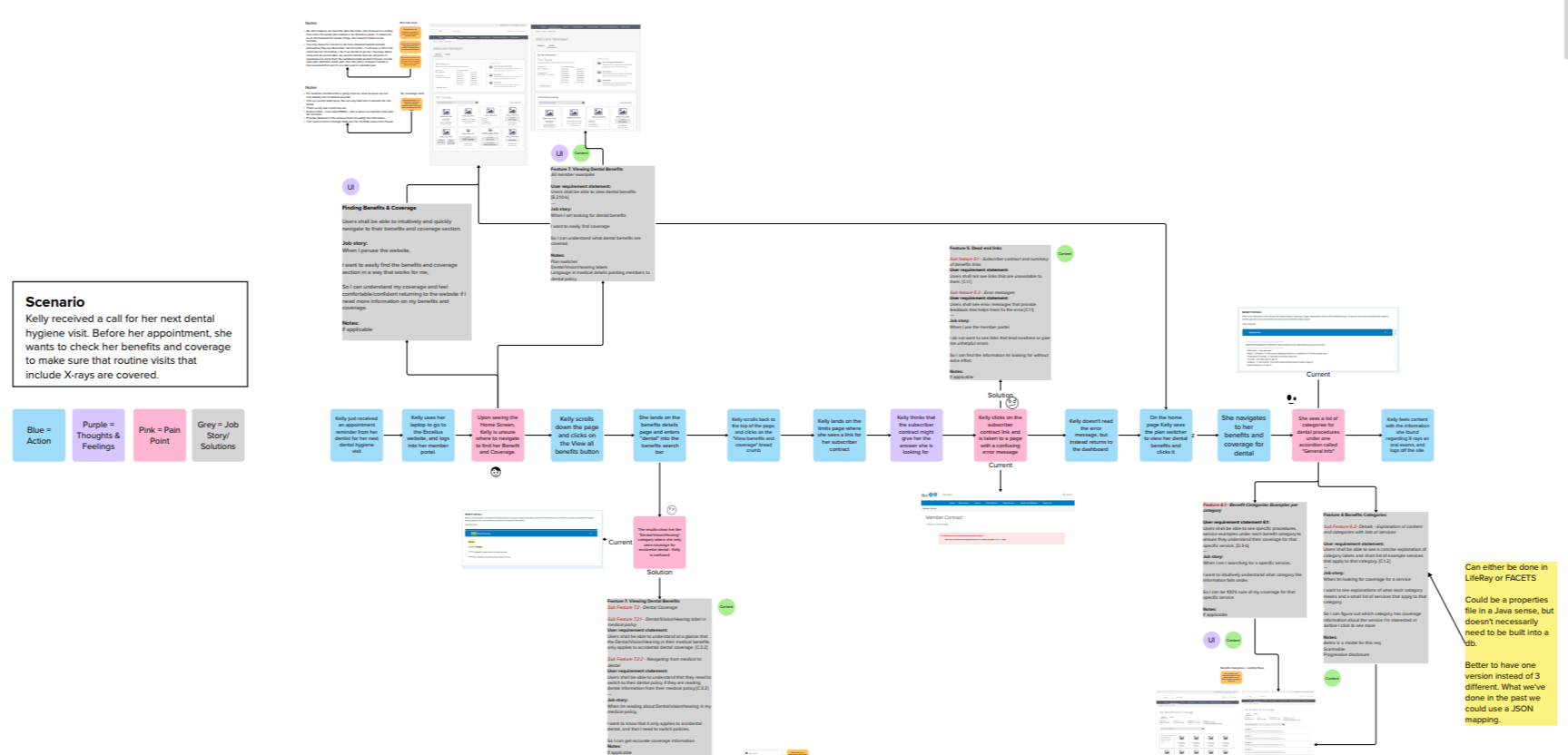
Participants were tasked with trying to identify what their coverage would be for different benefits. The first was to figure out what their coverage would be for occupational therapy, the second was to find coverage for a cholesterol triglycerides test, and the last was to find coverage for an MRI. Overall, particpants struggled with two main tasks:
During research we asked participants to share some demographic information (if they were comfortable), and observed them closely during their tasks. This allowed me to gather enough data to synthesize research-based personas. I created three personas based on the different types of plans that our members might have. After creating the personas, I helped lead the project team through three journey mapping experiences (one for each persona).
Research examples and quotations coming soon.
Solution
Update the current experience to guide members through their benefits and coverage in an intuitive way, and give them the tools they need to better understand their costs and coverage to reduce calls to customer service and increase online self-service.
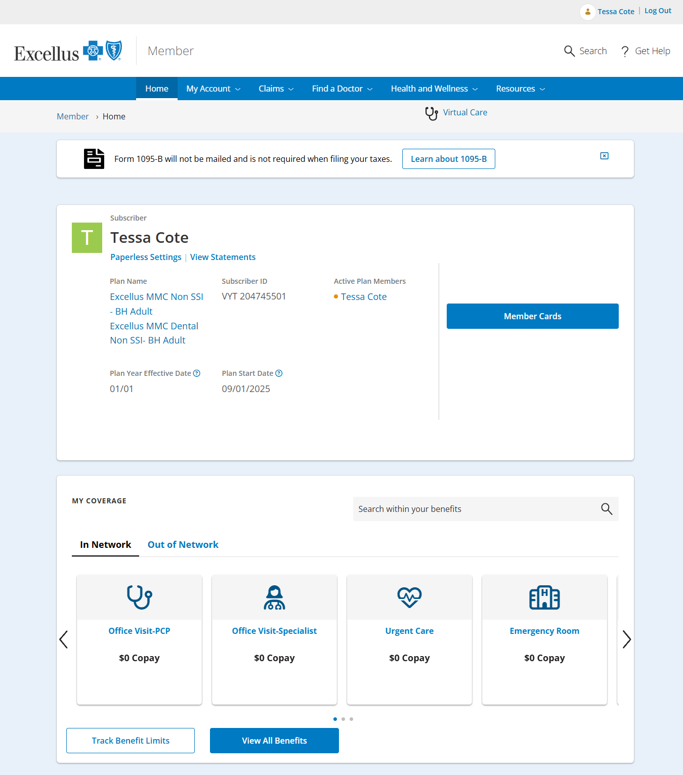
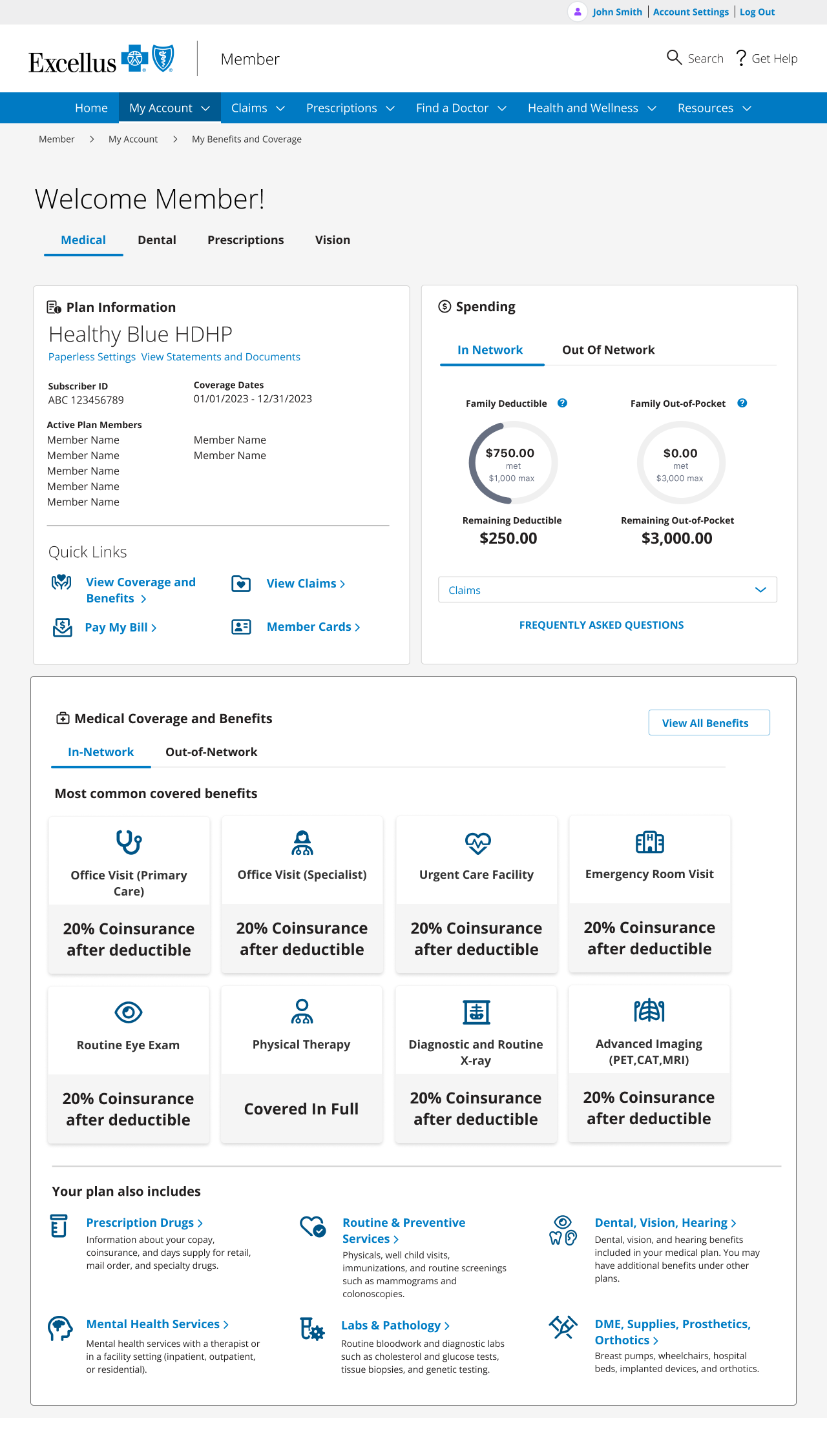
Member Dashboard
On the member dashboard, I focused on addressing most of the major concerns we encountered in research. Some of those included:
Removing the carousel and putting all copay/coinsurance information on one page
Showcasing other commonly sought-after benefits that may not have a straightforward copay/coinsurance
Adding the most common actions members perform on the web to the quick links section
Changing the plan switcher drop-down to a tab component to bring visual attention to the fact that the member may have multiple plans with different benefits for each
Lo-Fidelity Prototypes
I designed lo-fidelity prototypes with intent to solve some of the problems that participants faced. Our next steps were to test the wireframes with a new round of participants and discuss technical feasibility with the web team. I also demoed the wireframes for different stakeholder audiences to ensure we didn’t miss anything during research or overlook any business needs.
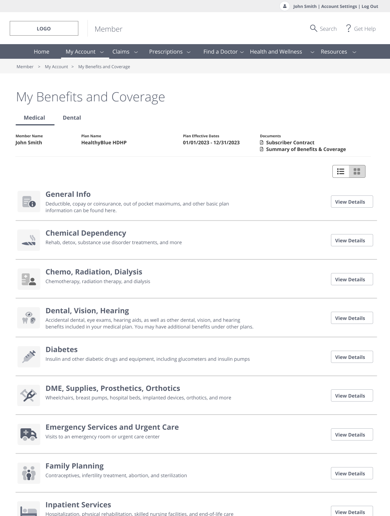
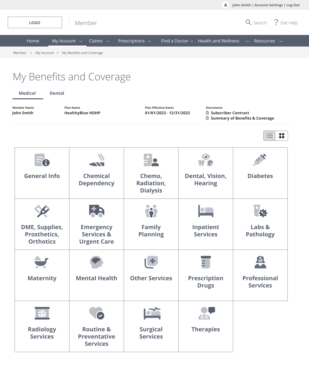
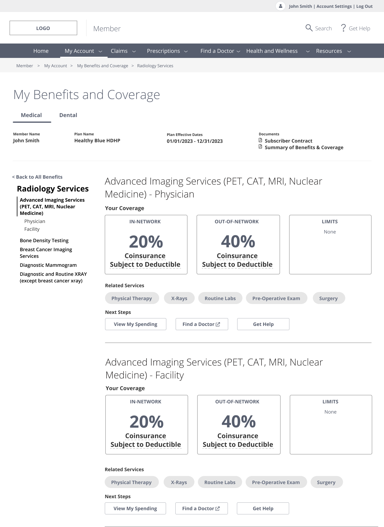
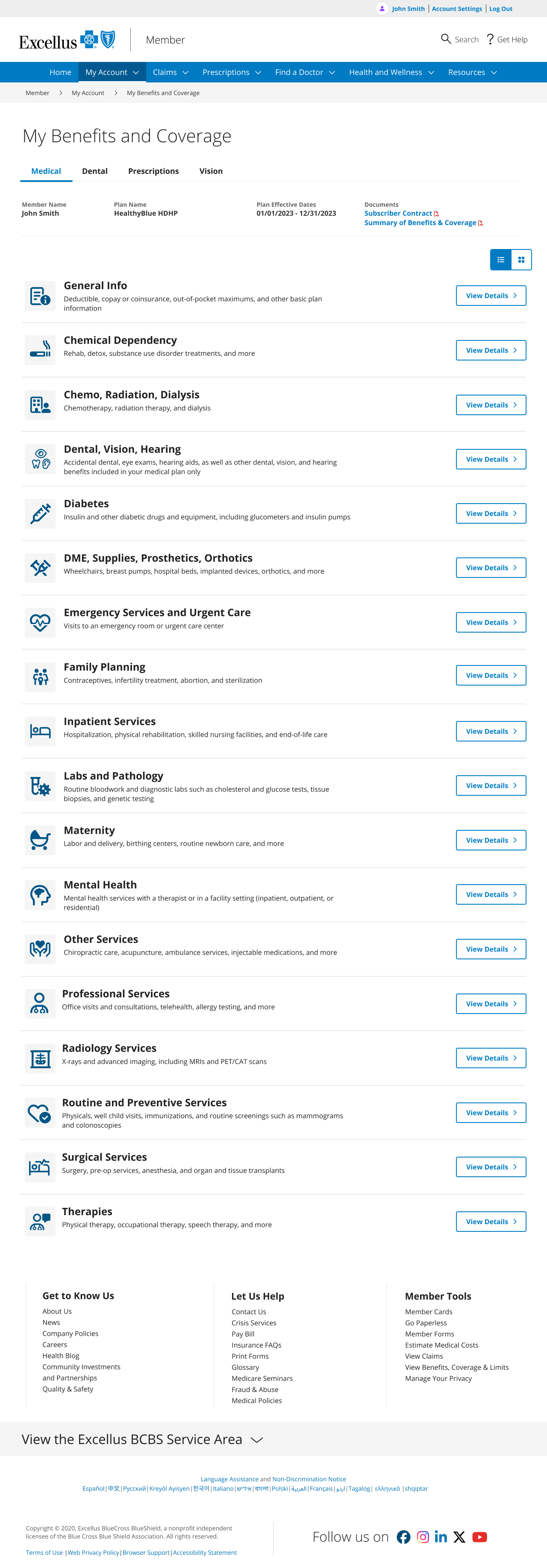
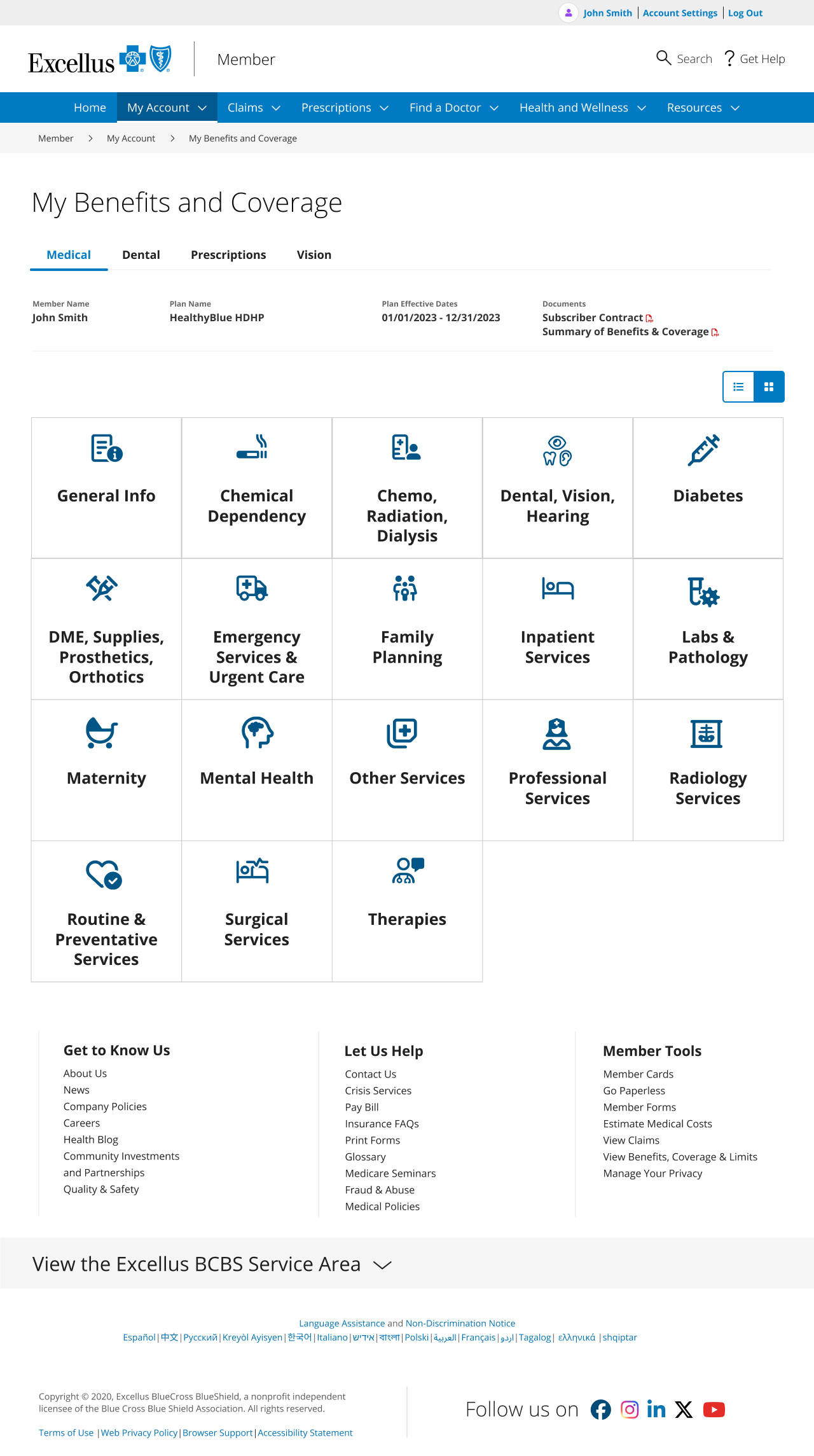
Benefit Details - Categories
To simplify the user flow, I repurposed the benefit details page to display the benefit categories (previously just accordions) with a title, description, and icon for each category. The descriptions were collaborated on with the customer service and content teams to ensure we were using language that members could easily understand. I created two versions, a list and a grid view, so that if members wanted to see all their options on the page without scrolling, they could toggle to grid view.
List View
Grid View
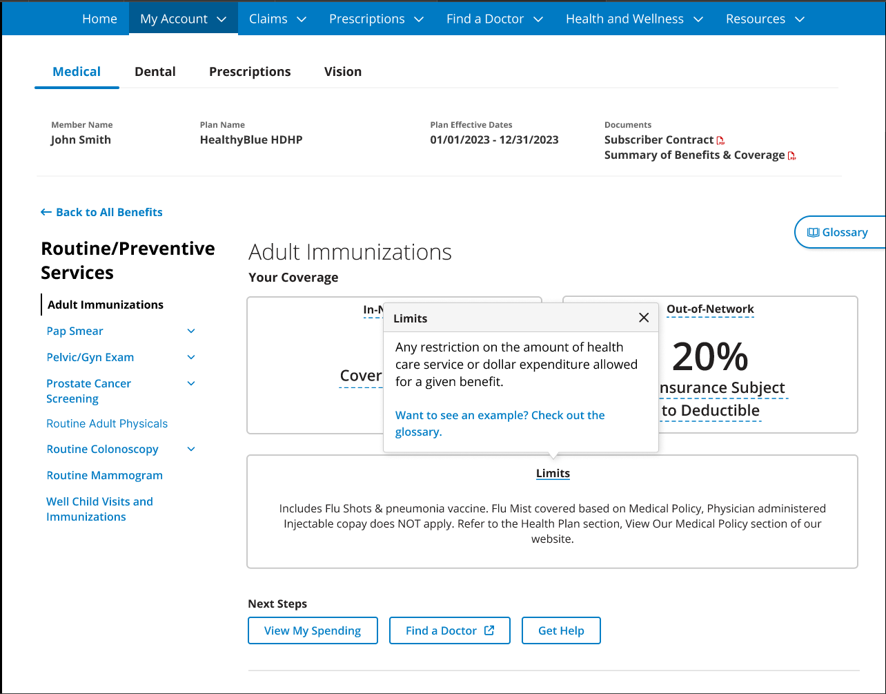
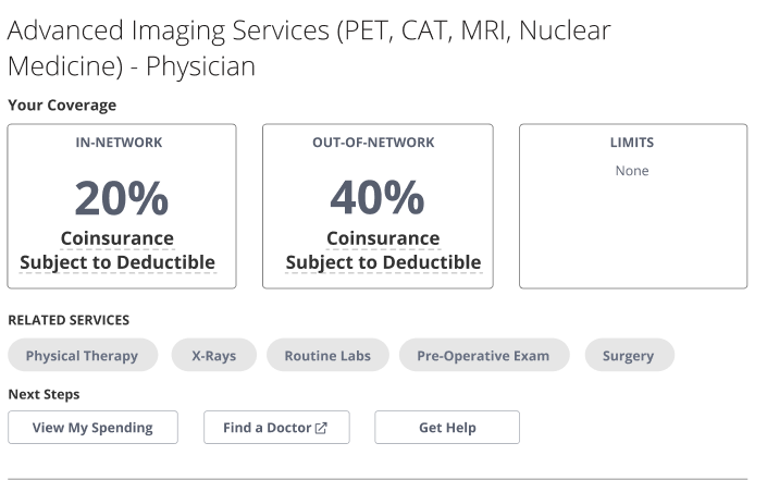
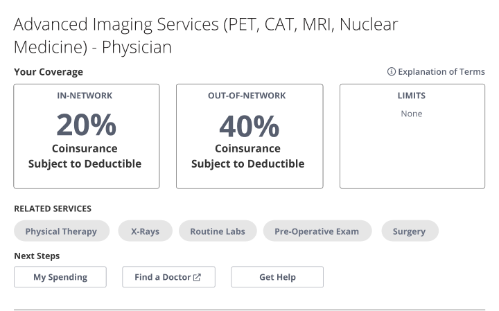
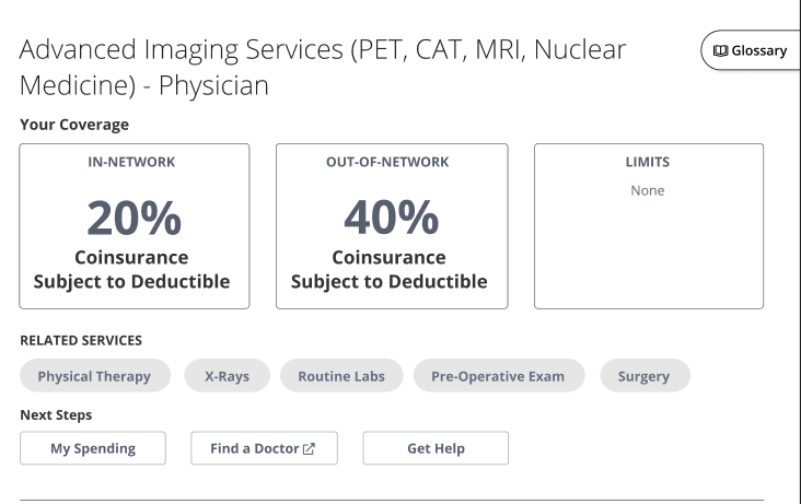
Benefit Details
On the benefit details page, members needed to see all of the sub-categories in each available benefit category, understand what their coverage and costs were for both in and out-of-network providers, and see any limits they might have for that particular benefit. Some of the most necessary UI changes I included were:
Adding a side navigation for previewing all available benefit sub-categories
Clearly distinguishing members’ benefit costs for in and out of network providers, as well as any limits they may have on those benefits
Providing suggested related services
Offering links to tools that will help them determine their next steps, such as their spending accounts (deductibles met) or the Find a Doctor tool
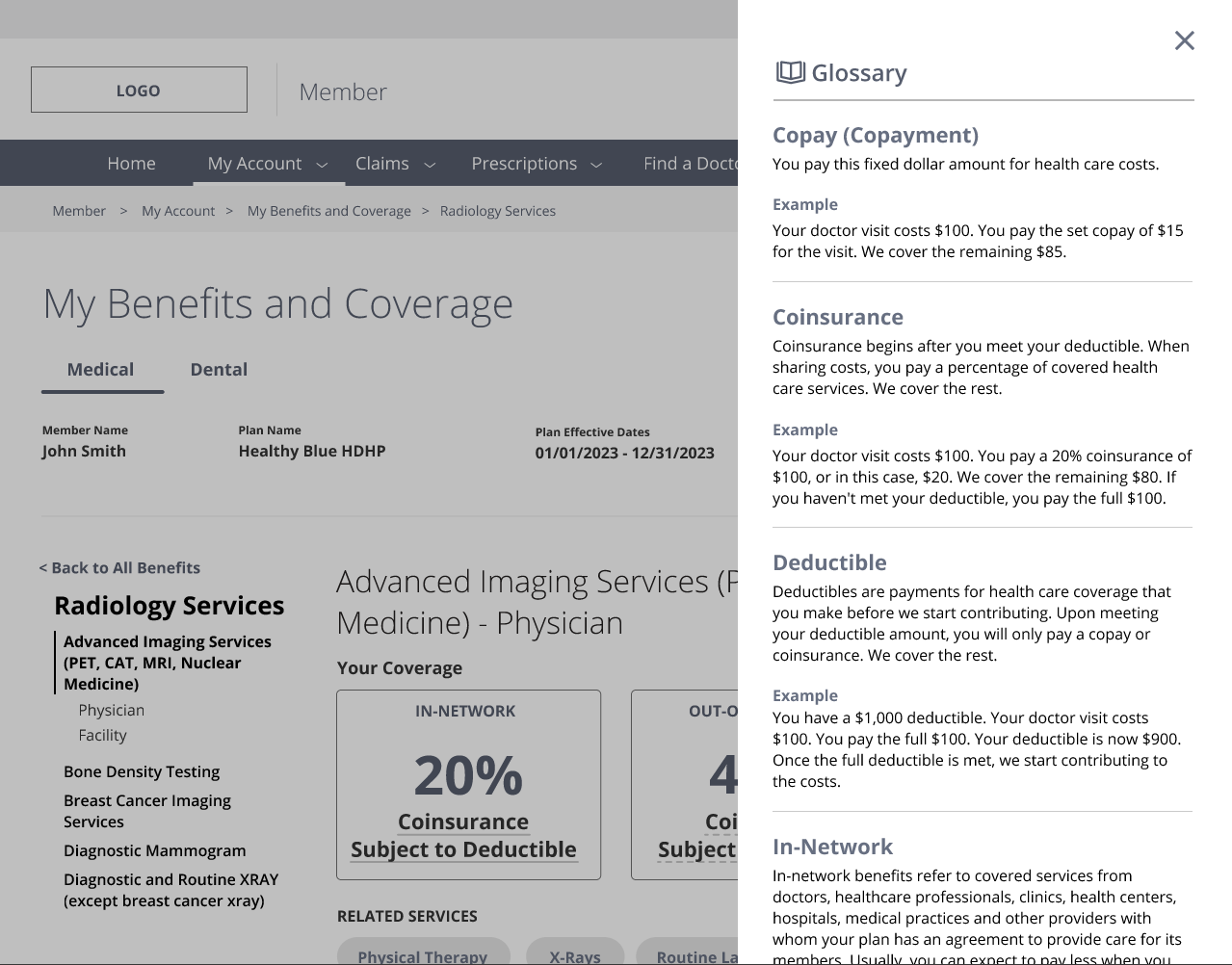
One of the biggest struggles for members was understanding the insurance terminology in their benefits. One of the solutions I proposed was a glossary of insurance terms with examples. We worked closely with the content team and customer service reps to nail down easy-to-understand definitions and examples. I proposed four different ways to test how members might access this glossary:
Clicking on the terms that have an underline
A text link that read “Explanation of terms”
A button that read “Glossary”
A sticky sidebar that read “Glossary”
1
2
Understandability Elements - Glossary
3
4
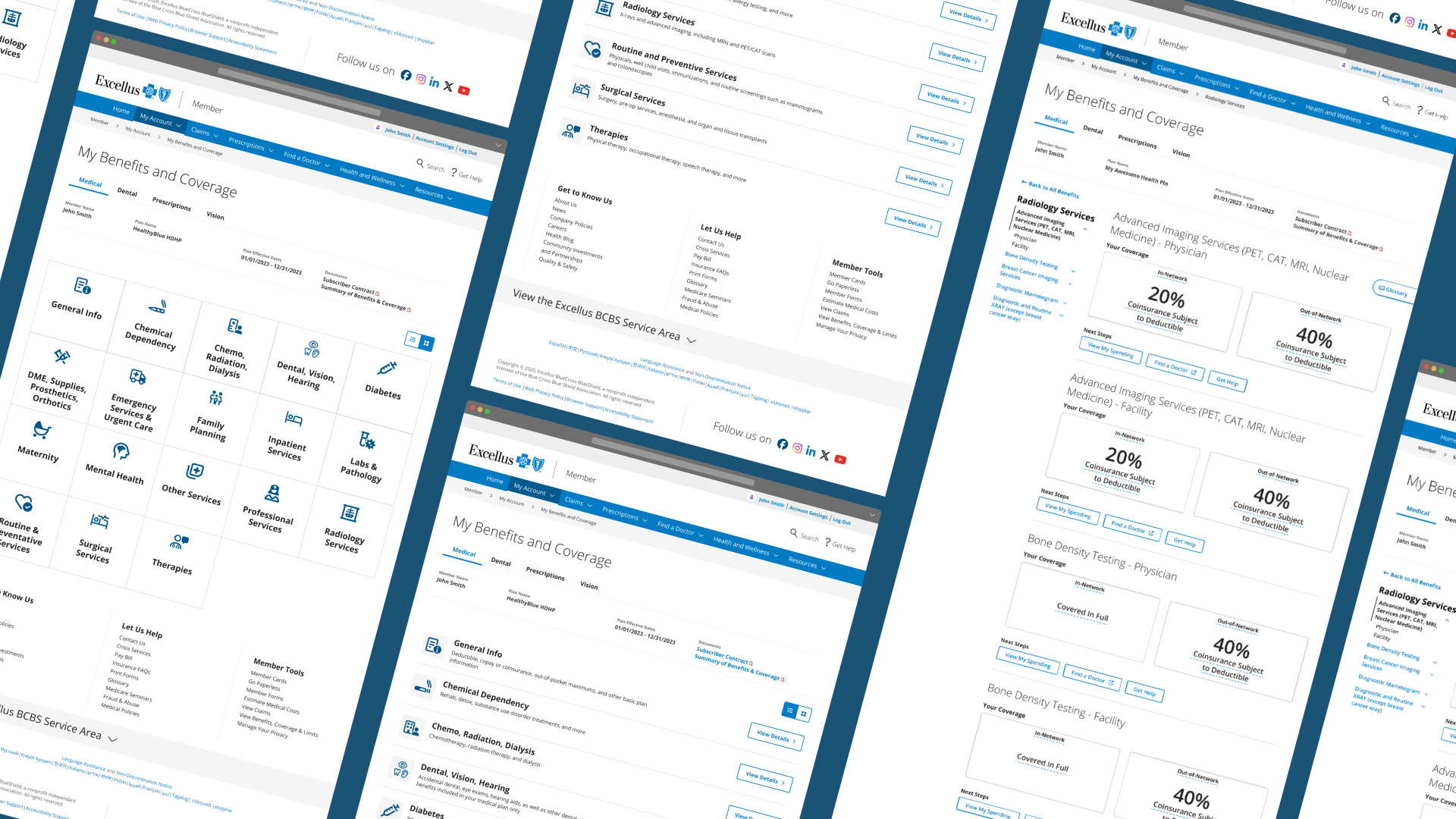
Hi-Fidelity Prototypes
After testing our lo-fidelity wireframes, we made some adjustments to the prototypes and began to develop hi-fidelity wireframes. Overall, participants had a higher success rate with the new designs, and the team felt satisfied with making adjustments to the term definitions and side navigation.
Member Dashboard
Benefit Details - Categories
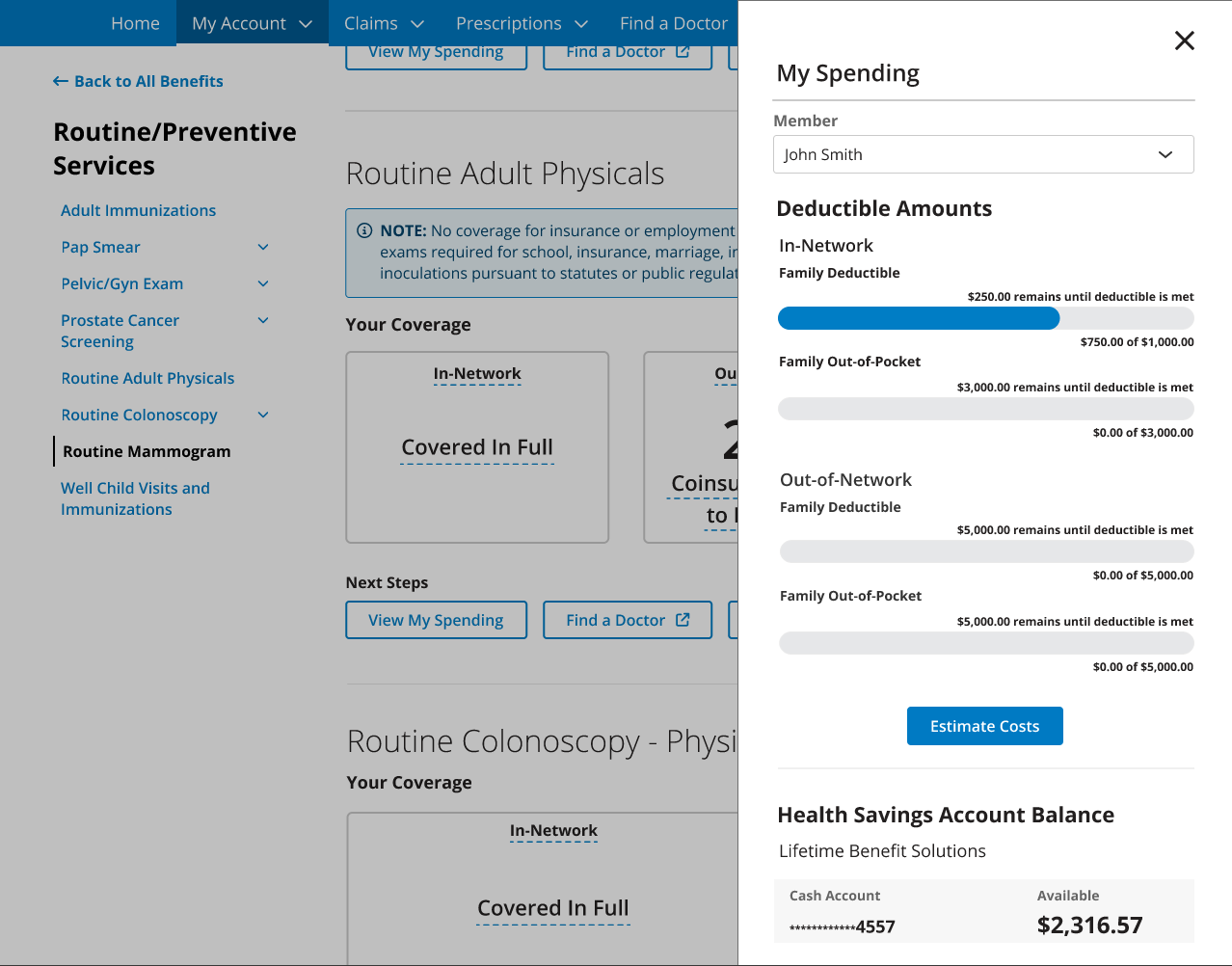
Spending Drawer
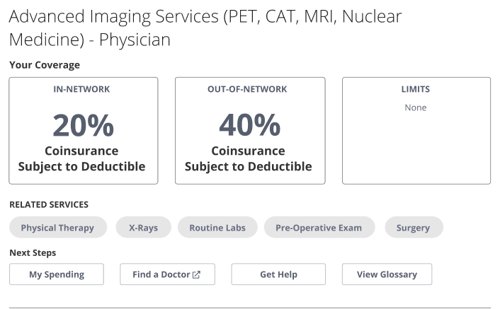
Benefit Details - Understandability Elements
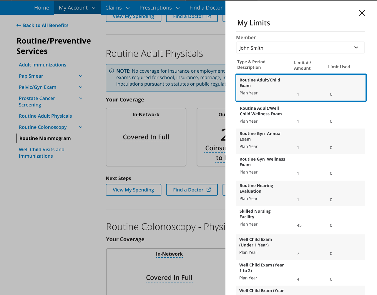
To streamline a member’s journey in their benefits, I proposed the concept of drawers for their spending accounts and limits to the development team. This would help members avoid getting lost when jumping between dashboards and pages to check their spending and limits. During testing, members stated that the addition of tool tips for each term in tandem with the glossary would be helpful for the comprehension of their benefits.
Limits Drawer
Tool Tips