UX/UI
Illustration
Print Design
Monsters of Manipulation
A beginner’s guide to avoiding digital manipulation
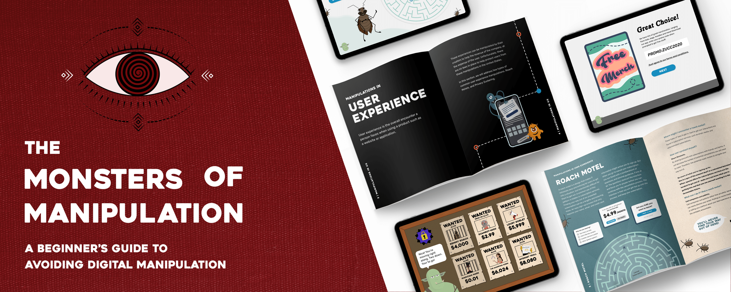
Monsters of Manipulation is a project that aims to educate novice internet users about dark web practices. With a small team, I created a game-like tablet experience and an informative book to complement each other.

Meet the Team
Monsters of Manipulation was created by Alex Kauffman, Dan Hunt and Tessa Cote.


Overview
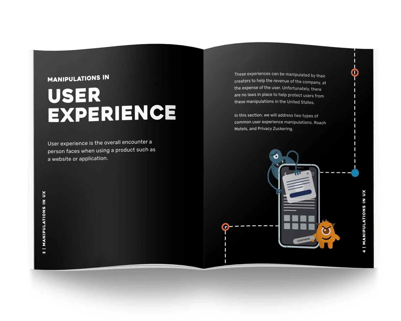
To start, we researched dark patterns on the web that many novice (and sometimes experienced) users fall victim to on the web. I took responsibility for dark patterns found in the user experience. The manipulations I chose were “roach motels” and “privacy zuckering.”
I created a tablet interaction and a full-page spread for each manipulation. I also took the responsibility of illustrating the cover of our book, our mascot Orion, and the “wanted” home page of our tablet interaction.
Roach Motels
WHAT IS A ROACH MOTEL?
Roach motels are designed to make it extremely easy and enticing for users to get into a situation, but intentionally tricky for them to escape. An everyday use of this pattern is hidden in subscription services. For the game experience, I wanted to simulate being caught in a roach motel. Users had the safety of Orion, and if they made an unwise choice that might keep them further trapped, he would be there to help them. The page spread in the book highlights the maze trap and gives readers valuable insight, like where they might encounter roach motels, how to protect themselves, and what to do about them.
Tablet game experience
For the tablet experience, I wanted to lead users through a mock roach motel, and have Orion give them tips if they choose a path that might lead them further into the maze. The maze helps demonstrate and how complicated it can be to simply cancel a subscription. This maze has three stops total to try and entice the user to stay connected and stay paying for the services.
Survey Fatigue
Collecting feedback from users about why they no longer wish to continue their subscription seems like good customer service and is pretty standard in the industry. However, some companies have weaponized the process by requiring users to answer a lot of additional and unnecessary questions to get to the actual cancellation screen of a subscription. The intention is to exhaust users with choice fatigue so that they will abandon the process of cancelling since it is such a hassle.


Discounted Offers
Businesses will often try to keep users by offering them a discounted rate. Upon initial review, it can look like you’re getting the service for less for the rest of the subscription, but often hidden in the fine print are the terms where the discounted rate only lasts a couple of months, and then will return to its regular rate. The hope from a business perspective is that the user will forget about the payment in the next couple of months, and they can resume pulling the original amount of money that they signed up for.
Pattern Interuption
Familiar UI patterns help establish a candence in a users journey. This might be the confirmation button always having the same visual treatment, and the cancel button having a secondary treatment to help users quickly identify the most likely chosen action. This pattern can be manipulated to ensure actions that benefit the business, and not the user, are visually priotized.
